Creating A More Efficient Website for SSE Energy
I led the responsive redesign of SSE’s public website over a period of 10 months as part of a wider digital transformation.

Background
By 2018 SSE’s public website was starting to creak. Built on an old technology stack, it was slow and visually dated. Updating content was a lengthy, cumbersome process and the site did not behave at all on smaller devices.
SSE started a digital transformation piece to implement a new site infrastructure and CMS, and took the opportunity to update the design at the same time. I was engaged to redesign the site as part of this transformation.
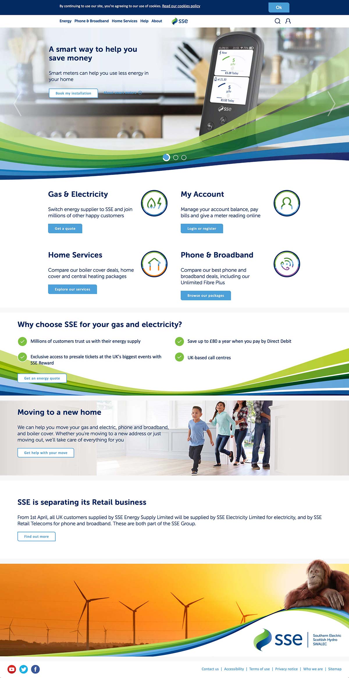
Above: SSE’s old website (2018)
Defining the business objectives
Ostensibly, the aim of the project was to ‘improve the site’, a fairly wide-ranging brief. To help narrow this down into key areas of focus we challenged the business — “what does success look like to you?” The responses fell into a few categories:
- Better support customers who want to self-serve via the website. SSE’s Call Centres were unable to redirect queries to their website because the relevant content was buried deep within the site, meaning users were unable to find it and had to resort to calling up instead.
- Make it work on and be sympathetic to all devices. Everything from how it scales between viewports to how fonts & imagery are prepared and loaded.
- Make it scalable. Content had to be easy to update via the new technology, but the site should be structured as to be able to house new content as & when it gets created.
- Make it accessible. Nothing less than WCAG AA compliance would do.
The last three objectives could be achieved through good design & build, but meeting the first one would require us to understand more about customer behaviour.
Understanding customer motives
To understand why customers were phoning instead of using the website, we started by speaking to staff at the Call Centres and using their internal analytics to create a list of the queries they were handling. We found that customers fell into one of two camps:
- Customers who cannot complete their desired task online (the functionality doesn’t appear to exist)
- Customers who do not know they can complete their task online (the functionality does exist, but users do not know to look or can’t find it)
Clearly, findability of tasks & services was poor.
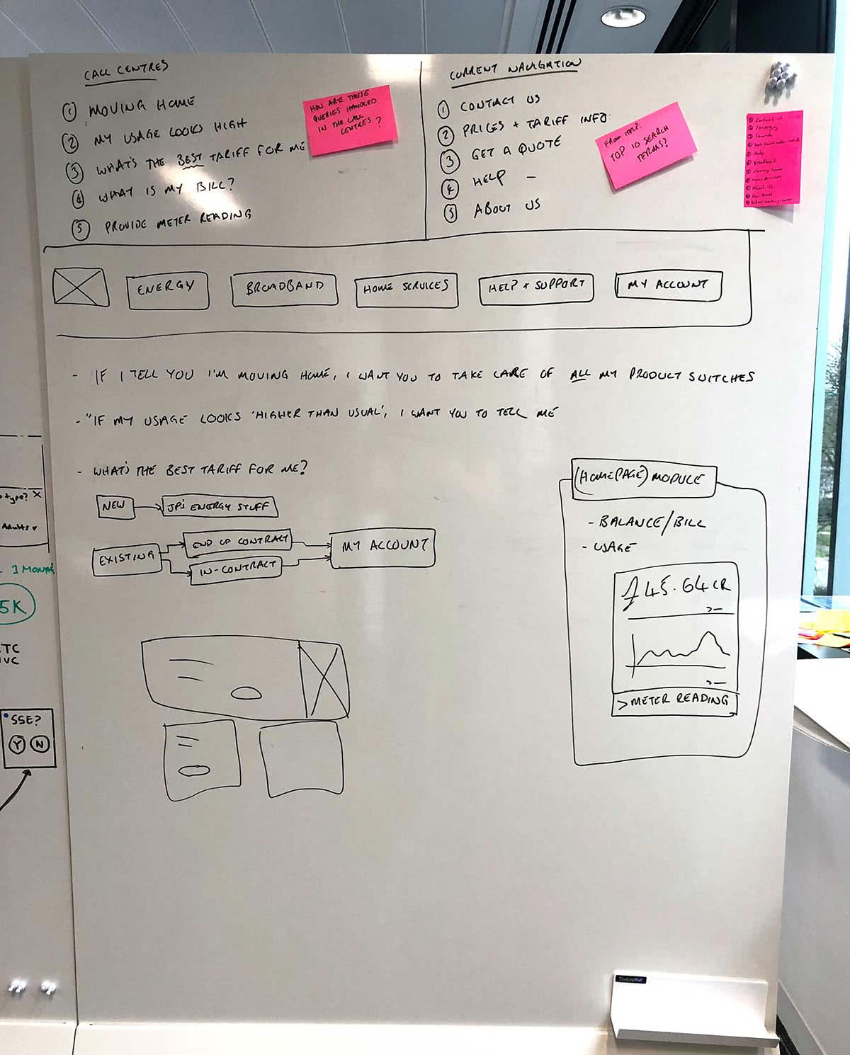
Above: Mapping out call centre queries against navigation click rates to find the most common user tasks
Analysing site traffic
We had a pretty good idea of how to improve the site for customers, but we needed a picture of how to improve it for non-customers. The analytics for the existing site weren’t great, but they did show the most trafficked pages and click rates for the navigation.
The results weren’t surprising: users were either arriving at the site to try and complete a servicing task (“I want to give you a meter reading”) or they were looking for a new service (“I want an energy/broadband/home services quote”).
We now had a more focused brief to work with: create a site that better supports these core journeys.
Improving navigation & signposting
We knew that a percentage of customers were unaware of the depth of functionality available on the existing site, and we suspected hierarchy & labelling were the biggest culprits. People just weren’t seeing the starting points for the core journeys.
For example, the existing navigation referred to “Home Services”, a collection of services relating to insuring a home, it’s heating and electrics. The term was well understood within the business, but it made no sense to customers: they would be looking for phrases like “boiler cover” and wouldn’t necessarily know to look in “Home Services”.
This was the most egregious example, but by no means was it the only one: to find them all, we conducted a series of tree tests. First, we tested the existing structure without any changes, asking participants to perform basic tasks based on what we had learned from the call centres & analytics.
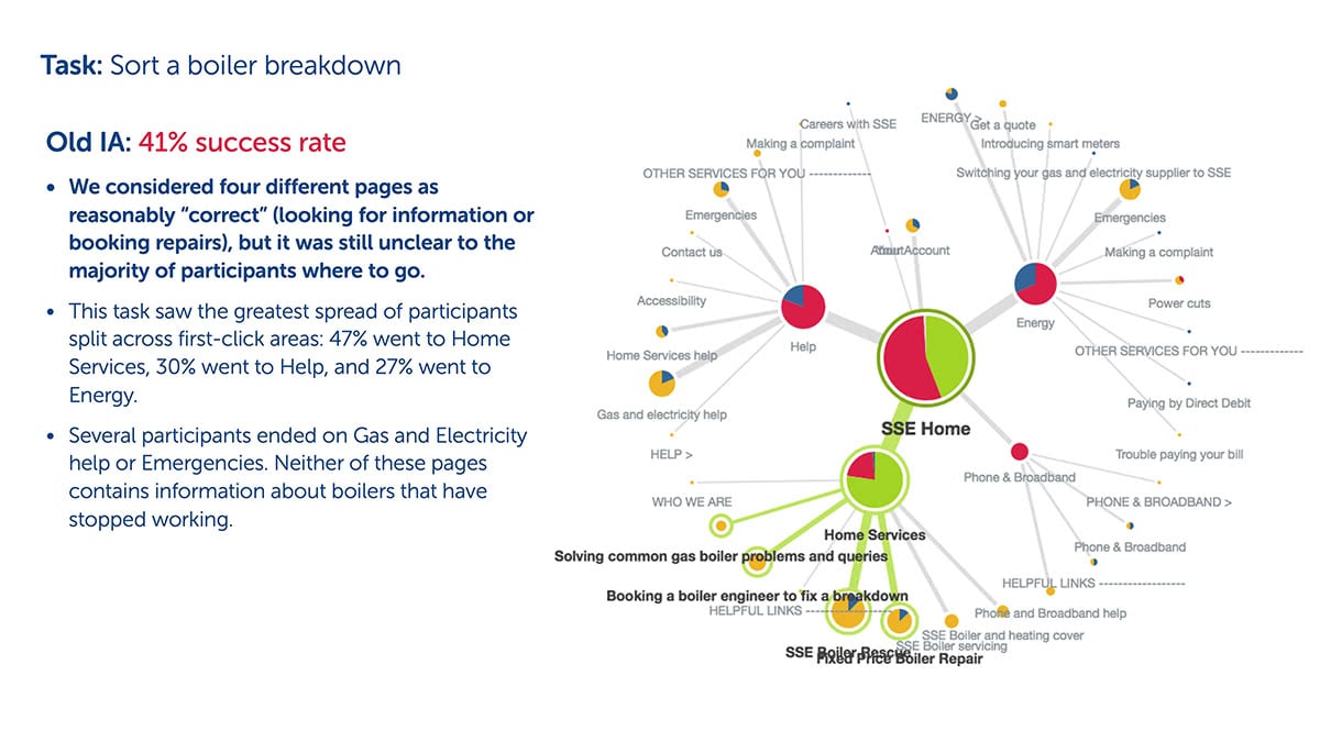
Above: Tree testing showed — amongst other things — that “Home Services” wasn’t a great label
As suspected, the existing navigation wasn’t supporting the core journeys. We reworked the navigation & labelling and re-ran the tests, this time with much improved results.
By changing “Home Services” to “Boilers & Heating”, we were able to show a 39% increase in task completion.
Something else the tree testing illustrated was the amount of duplicated content across the site, a side effect of the organic growth of the site combined with the difficulties in updating content and the poor structure of the site. A content audit would help assess the scale of this problem.
Auditing content
From a raw CSV sitemap output of the existing site we created a spreadsheet showing what content lived where and what it was called.
One of the things that stood out was that the majority of the help & guidance content was peppered throughout the site, with no central hub to access it. We proposed that we move all relevant help, support & guidance content to a main “Help & Support” section to make sure it could be found and added to by the business in future.
The content audit allowed us to highlight redundant content and map existing content to our proposed new structure.
Designing & validating a new structure
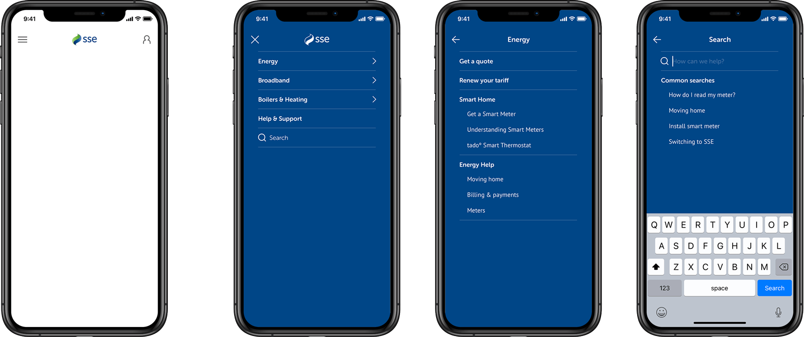
We’d already tree tested a skeleton candidate for the new site structure and so were relatively confident that what we were proposing would be a significant improvement. Our next step would be to test it with real users, so I set about designing a new navigation system.
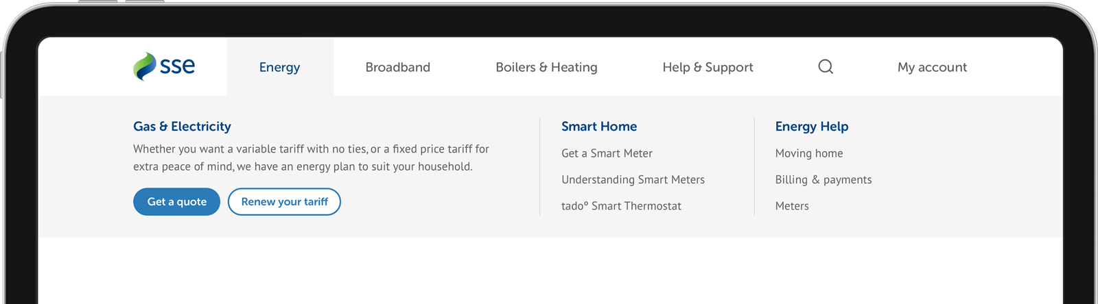
To make sure it laser-focused on functional and help content, I created a design that supported three levels of navigation. This meant in-page tertiary navigation could be kept to a minimum. Signposting the core acquisition journeys was also crucial, so these were a heavy visual element of the new navigation.
We tested the navigation across three sets of mediated user tests, making small improvements each time. Through testing it with real users, we were able to find the right balance of link density (“don’t make it hard for me to find what I’m looking for”) and core journey signposting.
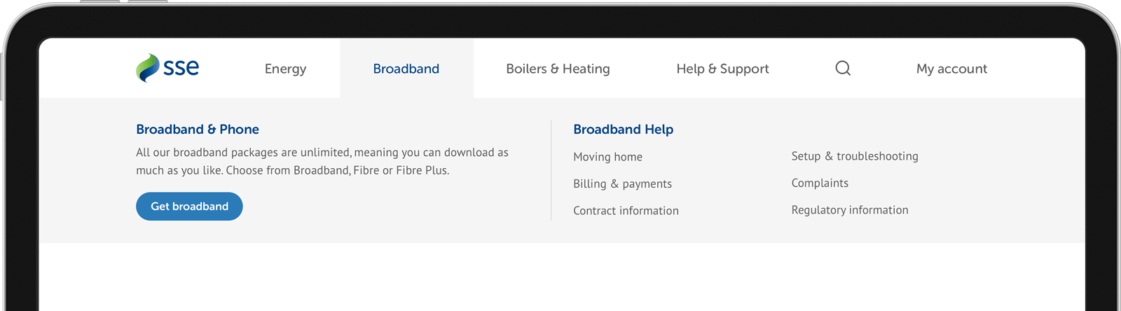
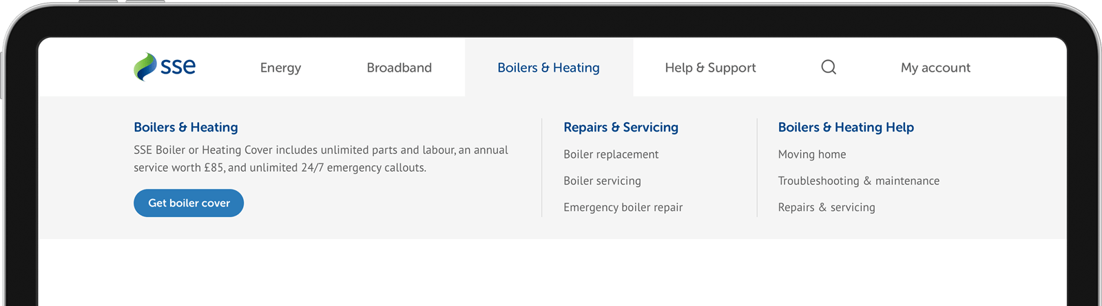
Designing a new homepage
Now that we had a navigation system that supported our core journeys, the next task was to design the homepage & level 1 landing pages. Alongside the navigation, these pages would help signpost & support our core journeys.
This task quickly boiled down to just redesigning the homepage, as most of the level 1 landing pages had recently been redesigned, and were therefore left alone.
Keenly aware of how contested homepage real estate can be within an organisation — and with one eye on how the old homepage ended up — I deliberately kept things simple. I didn’t want to create a design that would allow the business to overload the page with a mixture of different messages, lowering the effectiveness of everything all at once.
I created a simple design that would gently encourage the business to think carefully about the content on their homepage. With just three available slots, clarity and simplicity of message were key.
A major element of the new design was the ‘self-servicing panel’, a large bar containing links to the six core journeys our research suggested users were trying to complete.
Once the design was complete, the business were initially — and understandably — nervous, feeling that the new design was too limiting. We were able to point to our tried & tested new navigation and the new self-servicing panel to give them confidence that the homepage didn’t have to lift things quite so hard.


A new home for Help & Support
We already knew that we needed a centralised hub for Help & Support content, so that was the next page to get designed. I created a flexible design that catered for three levels of content, organised into logical subjects. The design demonstrated a scalability sorely lacking in the existing site.


A Sketch library to maintain design integrity
A lot of thought had gone into the new design, and a new set of standards and guidelines had emerged throughout the design process. To preserve these, I created a centralised Sketch library containing all the components required to build pages in the new site.
Existing pages could be used for reference, but the Sketch library democratised the design within the whole team, allowing anyone to create or use assets for the site.
The library also served as a great onboarding tool for new starters, grounding them in the brand, the logic and the building blocks of our newest piece of digital design.
A styleguide to socialise the design
To help socialise the new site around the business, I created an online styleguide showcasing everything from the design ethos to individual HTML components. I wanted the styleguide to be a living, breathing resource that could be used to communicate to all parts of the business, to resolve questions or issues and to serve as a ‘single source of truth’. Built in Gitbook, all members of the design team were given editor access and encouraged to contribute and own the new designs.


Launch & outcome
The new SSE website launched smoothly, with a strong focus on usability and clarity. Early results showed a 16% drop in call volumes to customer service and a 24% increase in online servicing journeys, showing customers were now able to find answers and complete tasks more easily.
But numbers weren’t the only success. The design team now had a flexible, scalable system to use for future updates, internal teams reported fewer escalations, and content authors found the CMS far easier to use, allowing them to keep information accurate and timely.
Lessons learned
Looking back, one key learning was the importance of aligning multiple business units around a shared design system early. With so many services under the SSE umbrella, the initial challenge was less about visuals and more about governance and consistency. Taking the time to get stakeholders aligned saved countless design and development hours later.
We also learned how critical clear signposting is in the energy sector, where customers often arrive under stress (for example, facing a billing issue). Simplicity and reassurance in content design had as much impact as the interface itself.
What’s next
The redesign set a foundation, but it was only a first step. Future iterations were planned to build in more self-service tools and deeper account integration, giving customers even more control over their energy usage online.