Nationwide Building Society Banking App Design
Between 2015-18, I was the design lead on the redesign of Nationwide’s banking app.

Background
Nationwide’s banking app had grown organically since its original launch in 2012, with new features gradually added in via a steady development roadmap. Built as two separate native codebases, new features had to be built twice and, as the pace of change accelerated, costs started to spiral. In early 2015 Nationwide decided to mitigate this by re-platforming both apps into one hybrid model.
The existing apps had confusing navigation paradigms, a hangover of the organic growth of design and functionality. For example, there were three different ways a user could initiate a payment. First, there was one way…then another was added…then another…and yet Nationwide didn’t want to decommission any one piece of functionality in case a proportion of the user base had become accustomed to it. Taking it away would leave those users confused.
What was needed was a complete reset with a completely new design and the replatforming presented the perfect opportunity.
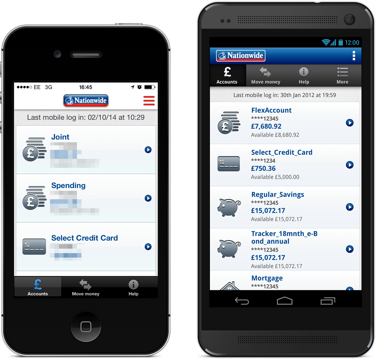
Above: The old apps. Each platform had a slightly different approach to the UI, but neither were particularly pleasing.
Defining the business objectives
The business objectives were fairly clear — Nationwide were moving to a hybrid build approach and wanted to use the opportunity to:
- Refine the existing functionality
- Add new functionality (based on achieving feature parity with their Internet Banking service)
- Create a unified look & feel across iOS and Android
- Ensure the app worked on tablets and phones
Nationwide also threw a ‘moonshot’ into our objectives: achieve at least a four-star rating on both app stores for the new app.
To deliver on these, I built out a core design team of 8 people including UX designers, information architects and UI designers. In addition to reviewing and interviewing candidates, I designed onboarding plans to ensure the team could get up to speed fast.
Defining the architecture
One of our first tasks was to solve the navigation & architecture issues inherent in the old apps. To do this, we ran some early testing sessions to find out how users thought about servicing their accounts. We created two prototypes to test:
- ‘Account-led’ where users would choose an account first, then choose a function to perform
- ‘Function-led’ where users would choose a function first, then choose which account to perform it on
We asked users to perform some basic tasks — check a balance, make a payment, view a transaction — using both prototypes to see which one worked best. We found that the majority of users thought of the account first, then the function but there were users who preferred the function-led approach. We therefore needed a structure that prioritised the account-led approach but would support function-led for those customers who preferred it.
We created an approach that allowed functions to be shown once an account had been selected. This is how we expected most users to use the app.
We also placed function-led navigation in an off-canvas menu so that it was in the app, but took second place to the primary account-led approach.

Above: The two candidate architectures we took into user testing.

Above: The chosen app architecture.
Defining & refining the journeys
One of the main aims of the project was to obtain feature-parity between the new apps and Nationwide’s Internet Banking service. This made defining the journeys pretty simple but we couldn’t simply replicate what was in Internet Banking — most journeys were old, clunky and were designed for desktop.
Every process was mapped out as a logical flow diagram. Not only did this help create a common understanding of each feature, it facilitated conversations around areas of improvement and highlighted dependencies around security and compliance.

Above: An example of the journey flows we created to help create a common understanding of each piece of functionality. This is the first-run experience.
Early user testing
We created a series of wireframe prototypes to test, understand and refine our journeys further. We ran 5 rounds of user testing with wireframe prototypes to give us the confidence that our journeys were viable.

Above: Early wireframes that were user tested.
Early visual designs
Once our journeys had been tested, we set about creating initial design sketches for key screens. It was at this stage that we had a conversation with the business around brand: applying the Nationwide digital brand as it was led to designs that felt visually heavy.
Around this time, iOS launched with it’s stripped-down aesthetic and I felt that our new app had to feel more at home than the brand allowed. I suggested flexing the brand to allow this, incorporating some of the subtler design cues inherent in iOS, stripping away clutter and unnecessary affordances to create a design that was visually simpler and put content front and centre.
It didn’t need to ‘feel’ overly Nationwide; this was people’s money and they would be logging in to check a balance or pay a bill, not to be swamped in the brand.
I delegated the wireframing and design tasks among the team, mentoring where necessary in translating research findings into design solutions. We conducted regular internal design reviews where we critiqued flows & visuals, ensured consistency with the emerging design system, and socialised the design with the wider business.

Above: Early design sketches. Whilst it was nice to see something high-fidelity, I felt this design direction was too heavy & fussy.

Above: The final design direction was cleaner and allowed the content to breathe. Throughout testing, we continually chipped away at the visual affordances on-screen, removing that which we found users didn’t need.
Incremental improvements
Once we had a set of journeys designed, we went back to our users and tested them again. We went through a further 8 rounds of user testing with design prototypes, again refining and iterating each time.
We focused on making incremental improvements, slowly removing that which was not needed. Affordances were dialled up or down as necessary and journeys were refined.
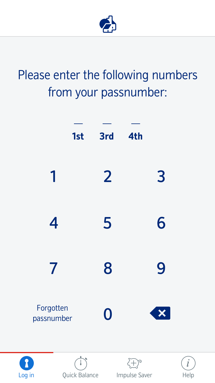
An example of how well this approached worked was demonstrated by the new login screen; we reduced the number of taps required to log in from 5 to 3.
We also proposed asking for passcode digits in order: the old design asked for a random selection of digits in a random order, the random order being seen as ‘more secure’ by the business (although there was little evidence to back this up). We found this to be unnecessarily taxing for users, who often had to resort to counting digits on their fingers to find the right ones to enter. We proposed (and validated through testing) asking for the random digits in order, which users found much easier to recall.

Above: The redesigned login screen reduced the number of taps required to login from 5 to 3. It also asked for the digits in order, which we found to be much easier for users to recall.
Supporting development
As we moved into development, I acted as the liaison between design and engineering. I held weekly syncs, did design QA, reviewed implementation, and helped the designers to work with engineers to balance design fidelity against technical constraints. I also encouraged designers to take ownership of specific features so they could deepen their understanding of the domain.
Development of the app was undertaken both on-and-offshore, so to preserve the integrity of the designs we created a set of comprehensive documentation, showing each screen of every process.
We also created high fidelity process flows for each piece of functionality to aid development and testing.

Above: High-fidelity process flows were produced for each process.
Above: The pre-authenticated space offered basic functionality without a user having to log in.

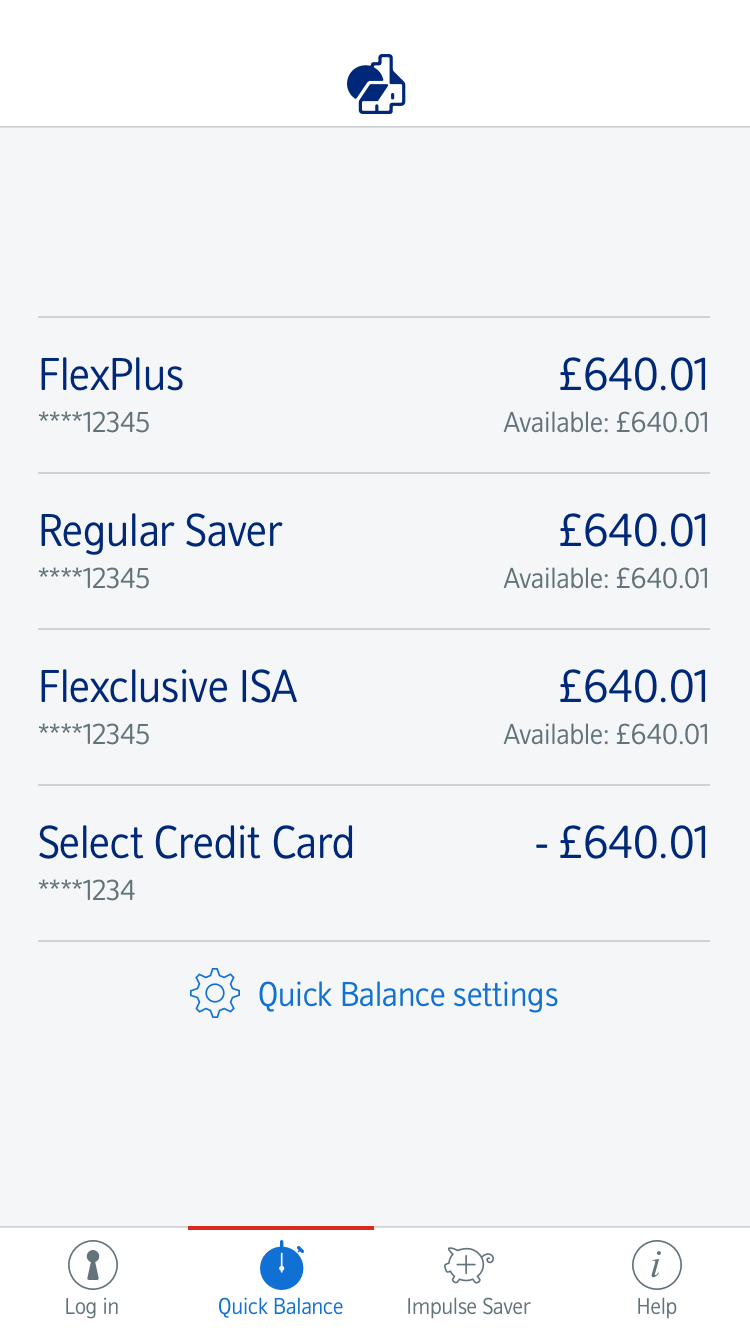
Above: The account overview screen. 99% of all user journeys were initiated from this screen, either by selecting an account or opening the primary navigation.
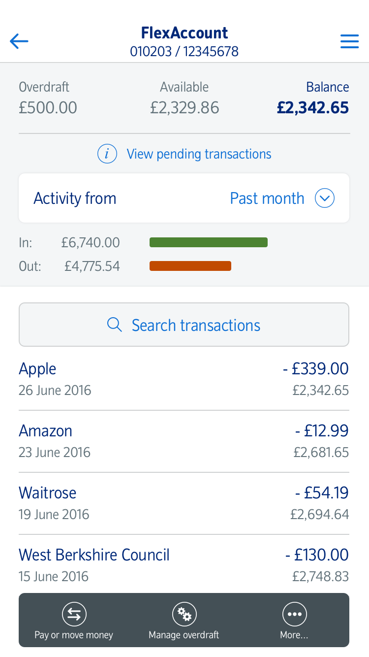
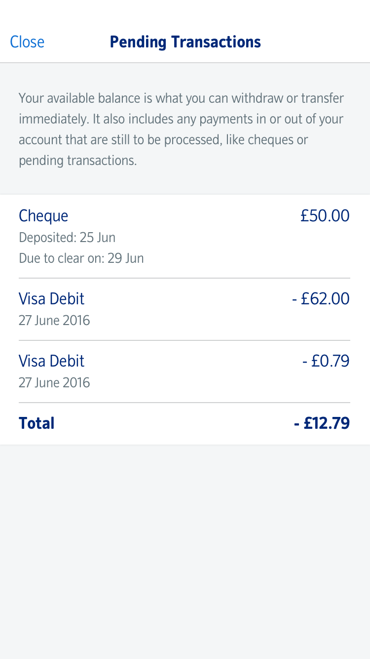
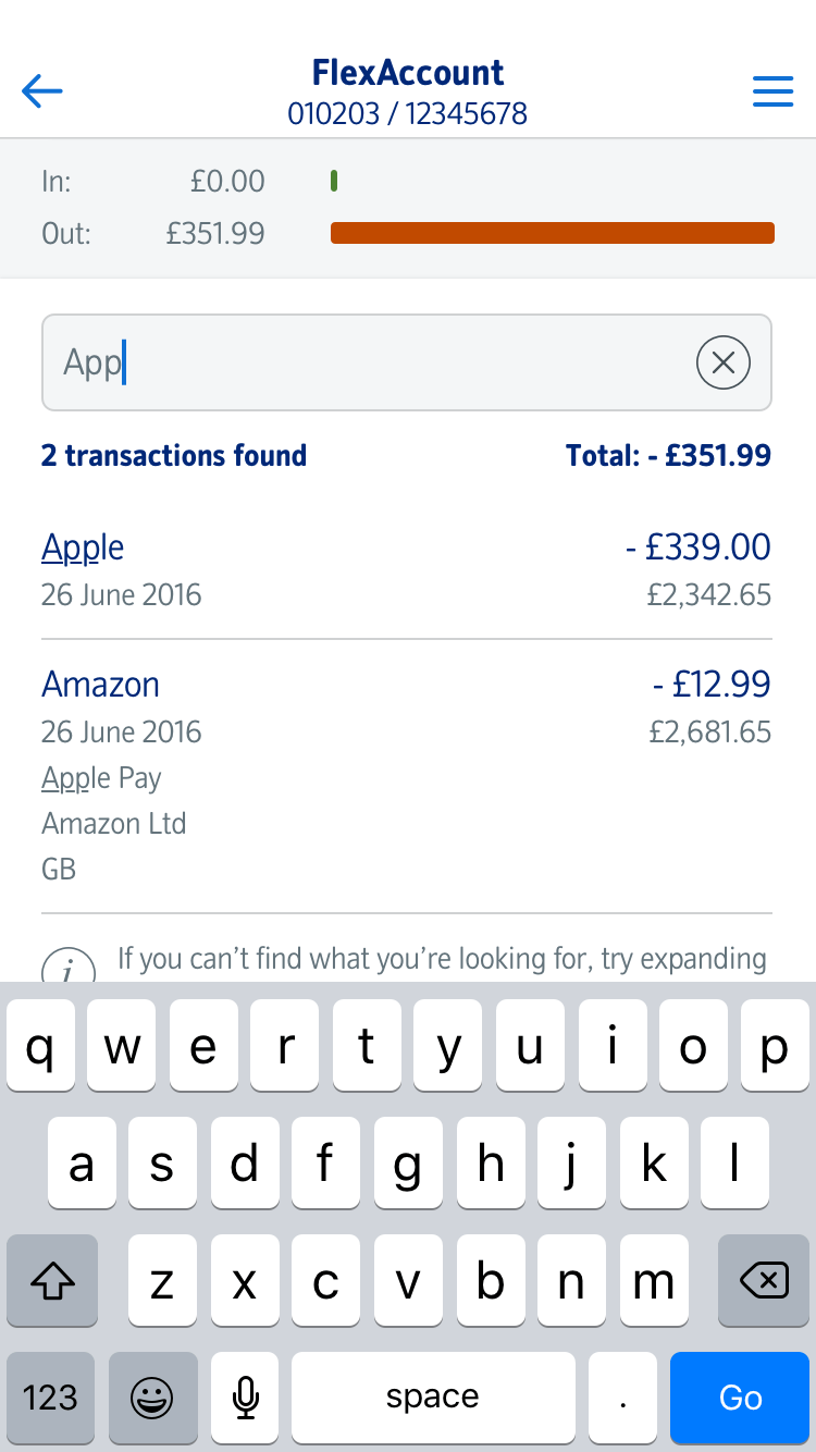
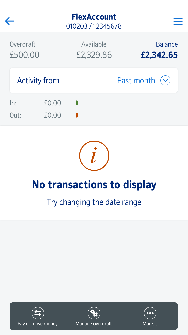

Above: The transactions screen was the most complex screen to get right.
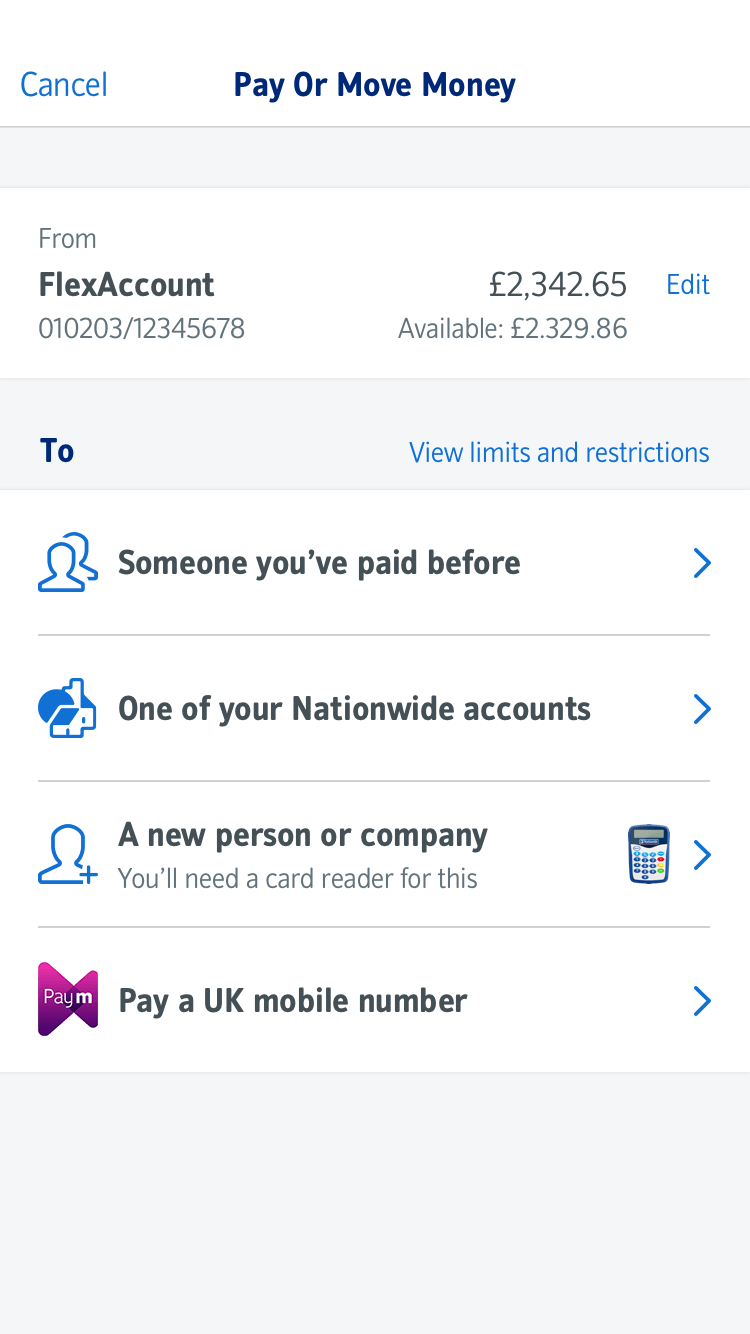
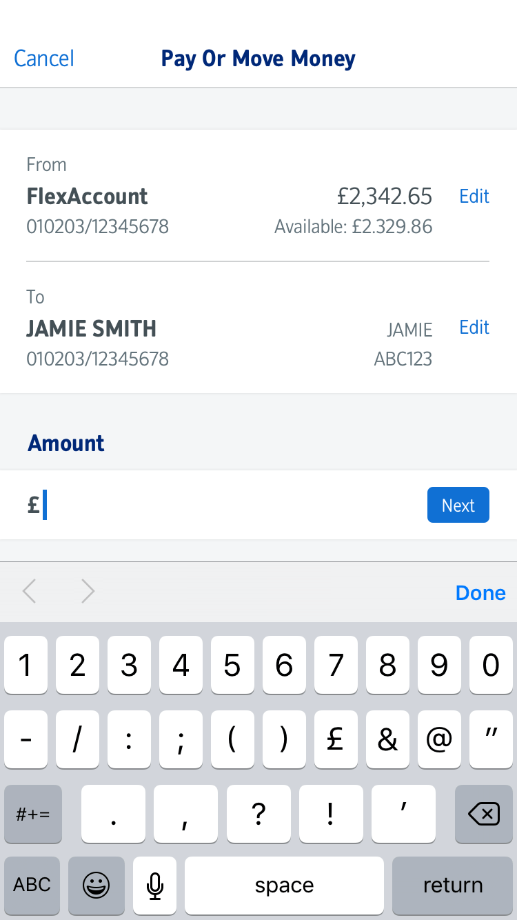
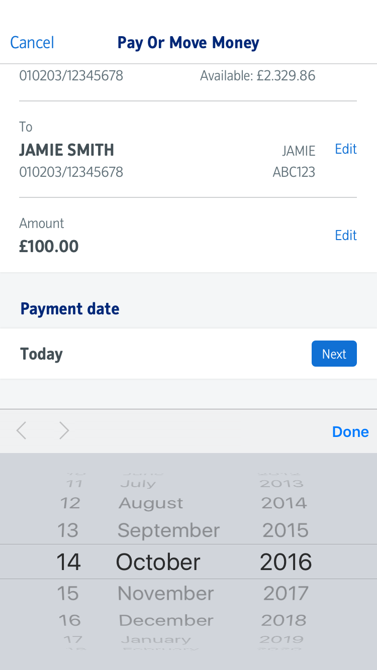
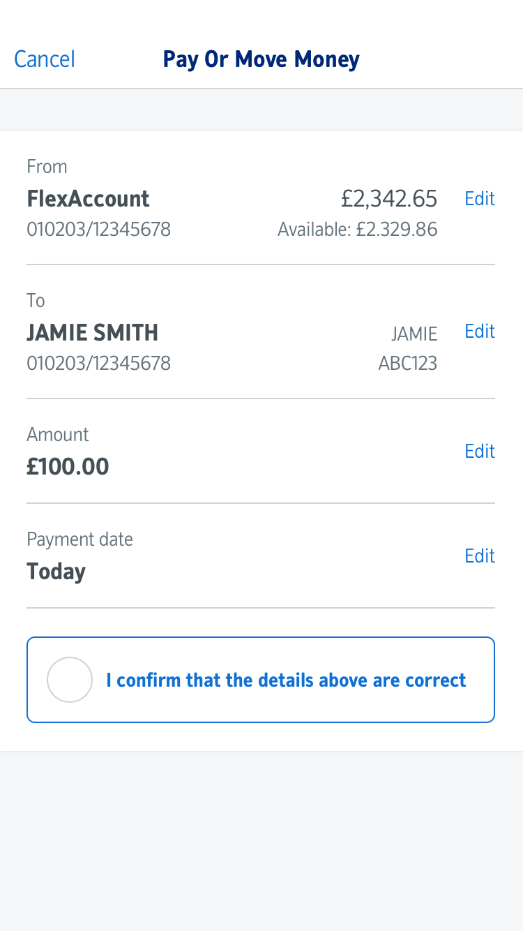
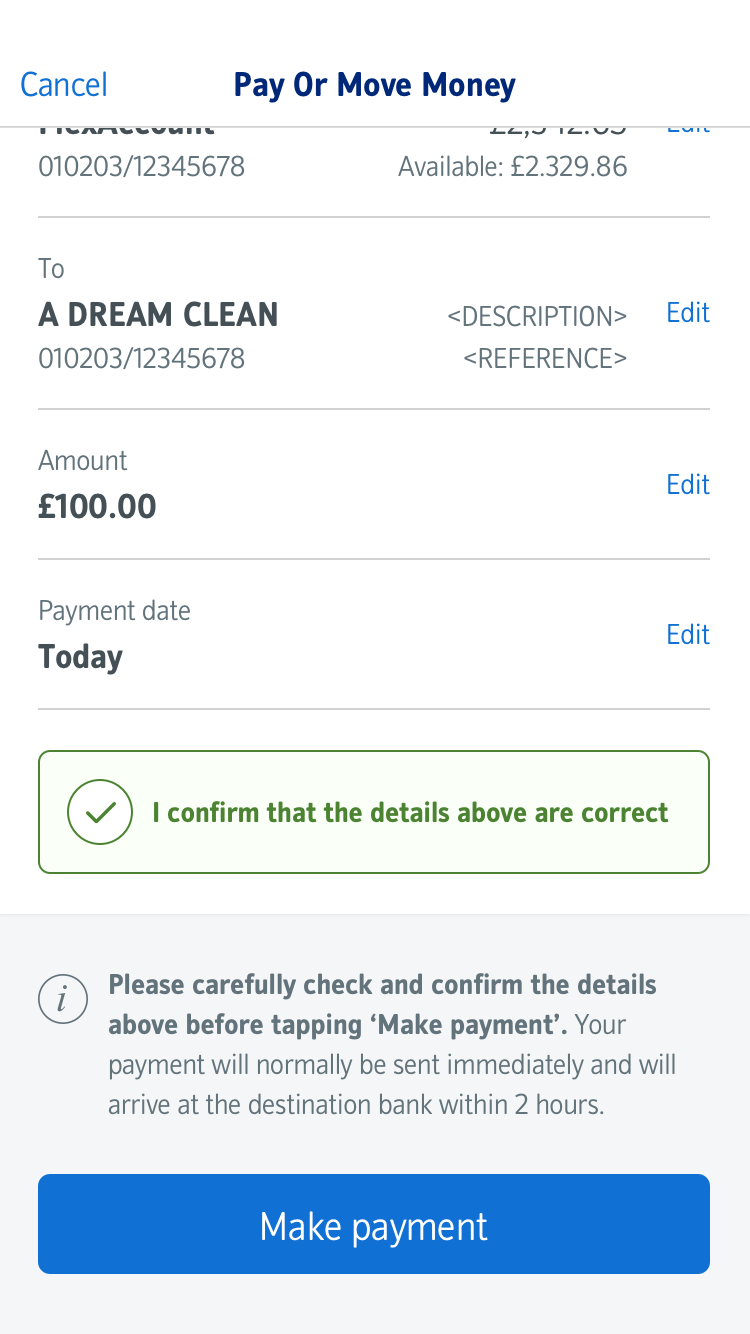
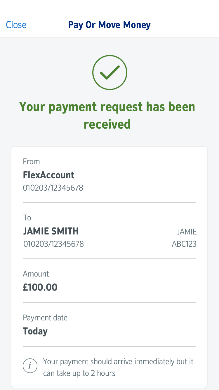
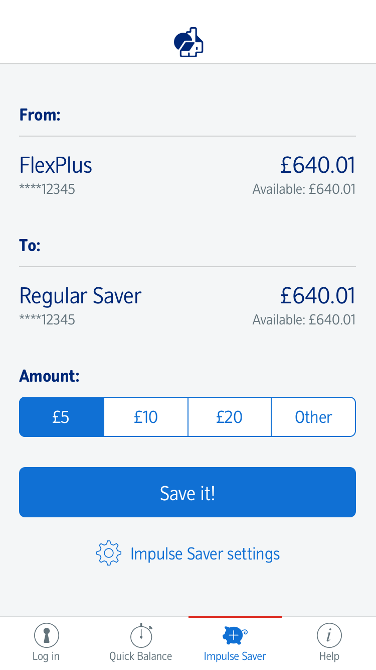
Above: We spent a lot of time creating a simple, clear and speedy payments process.

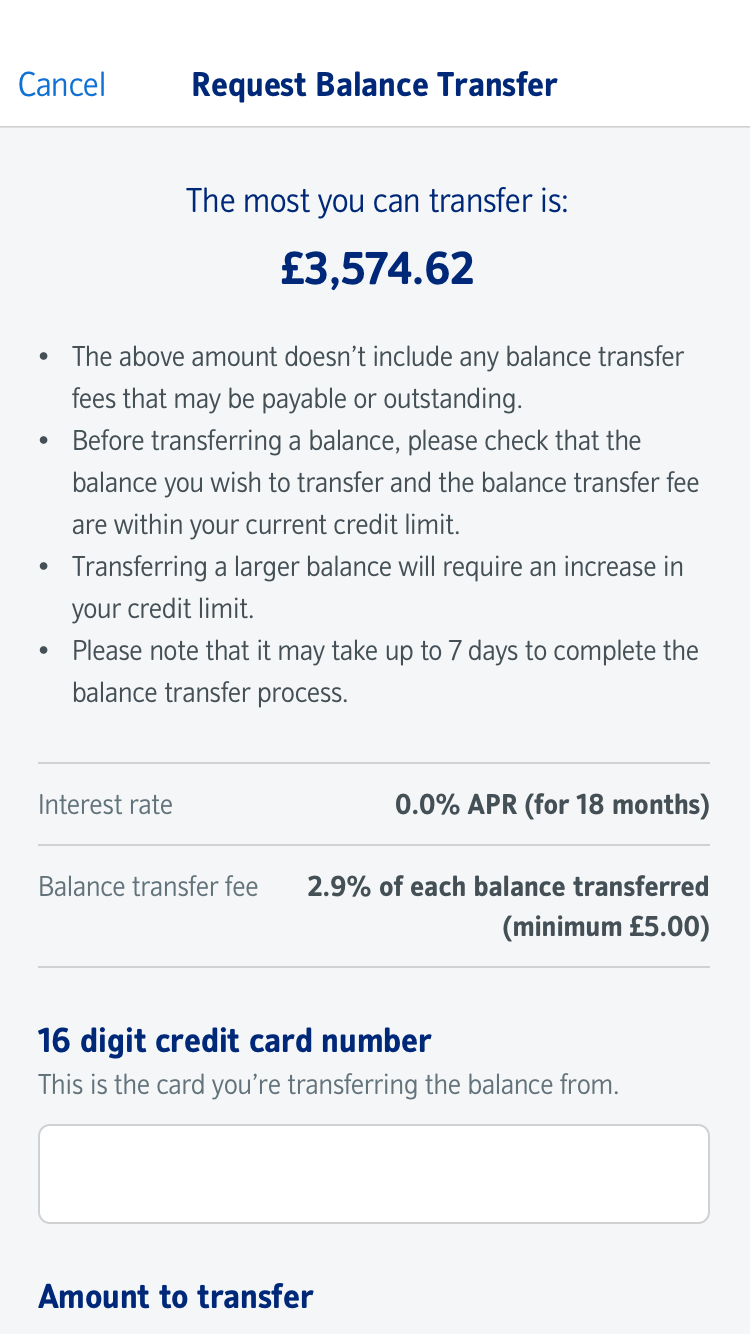
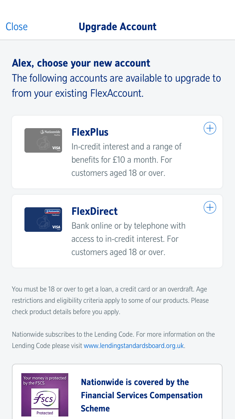
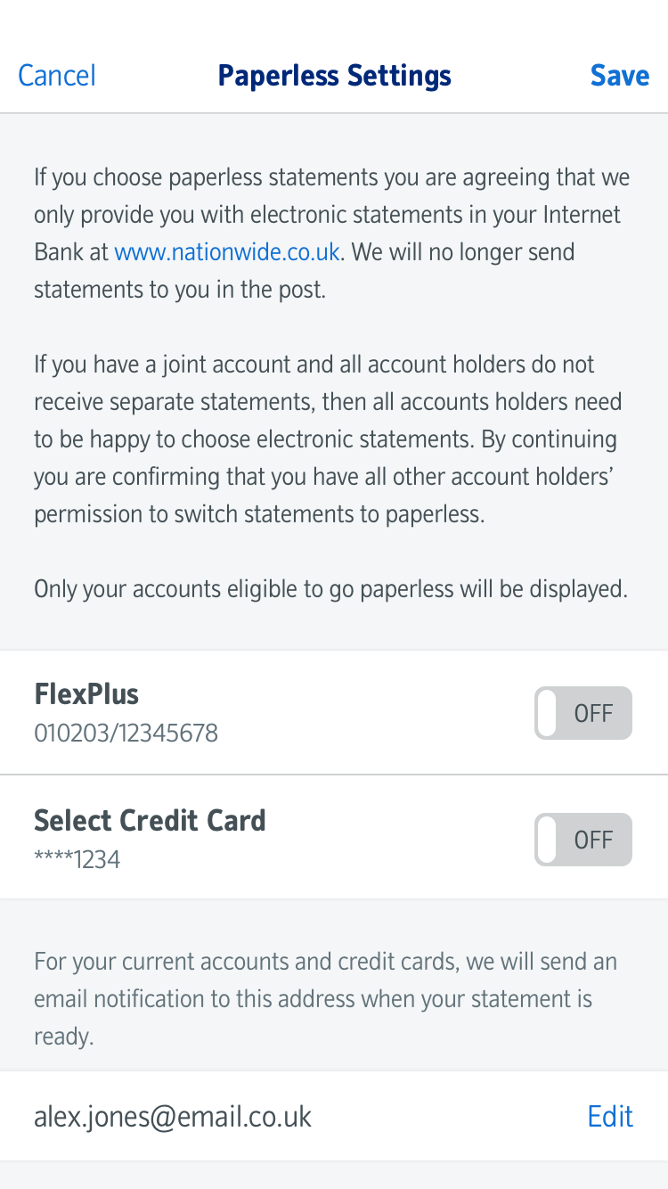
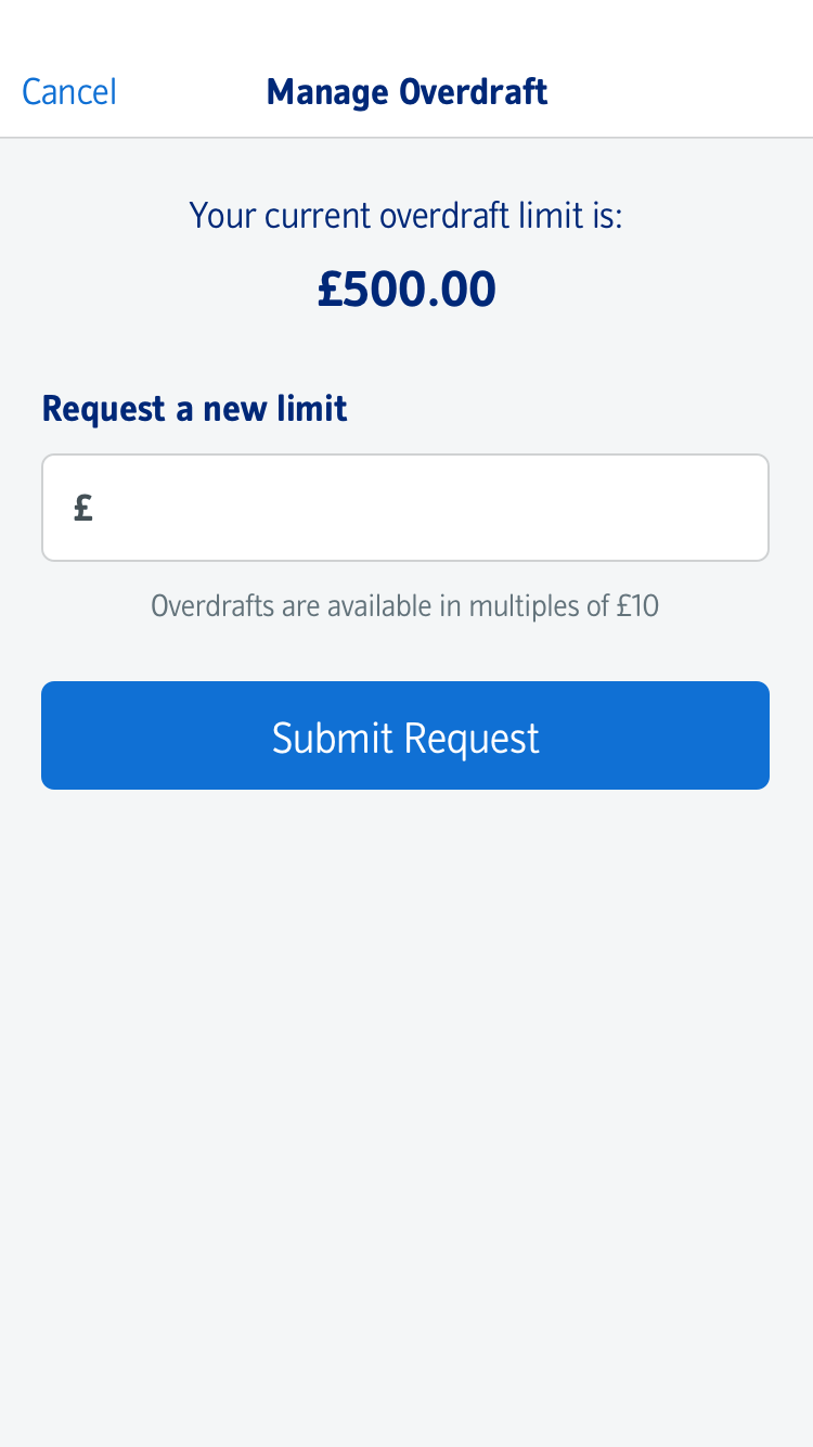
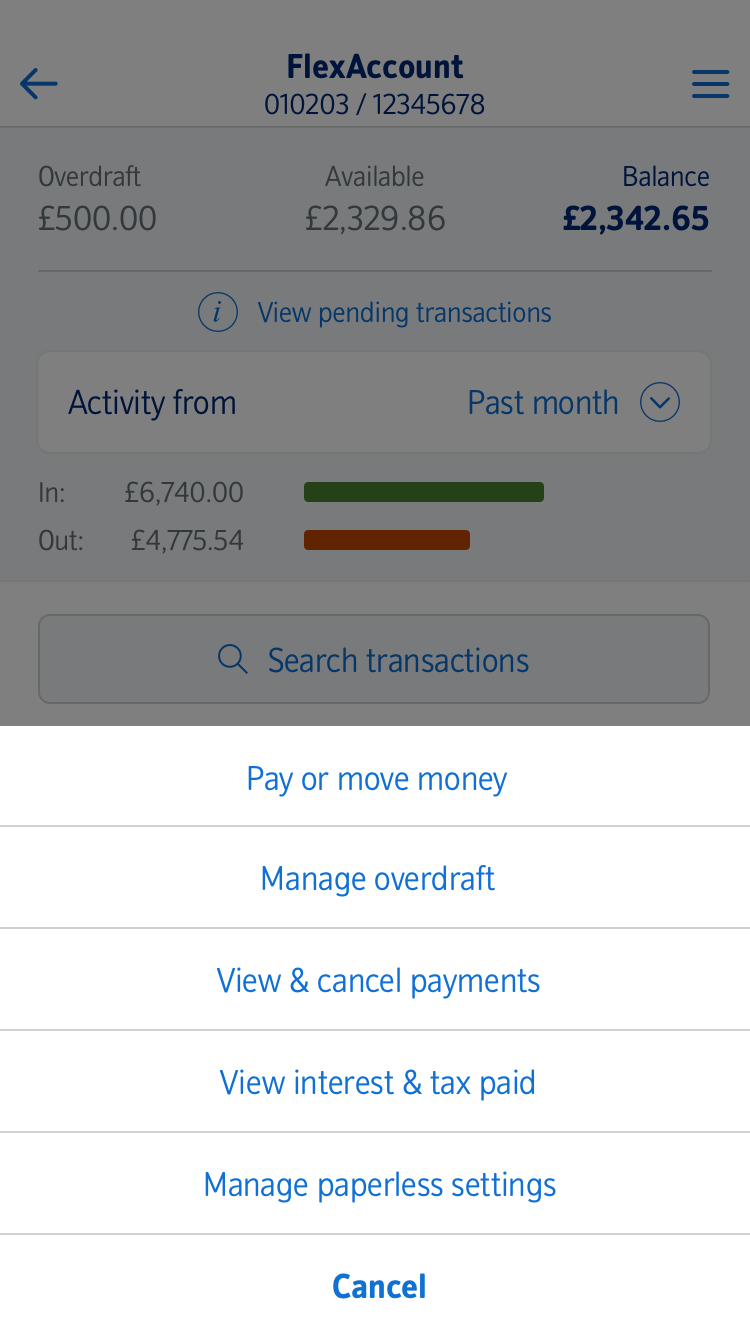
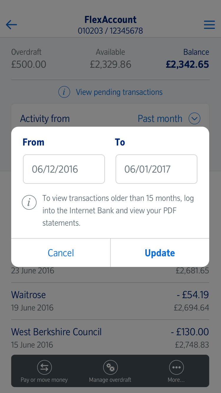
Above: All account-contextual actions were performed in self-contained overlays that allowed servicing to be carried out without confusing the user as to where they were in the app.

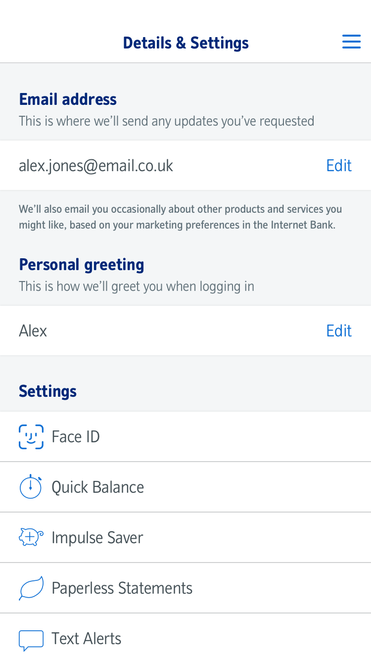

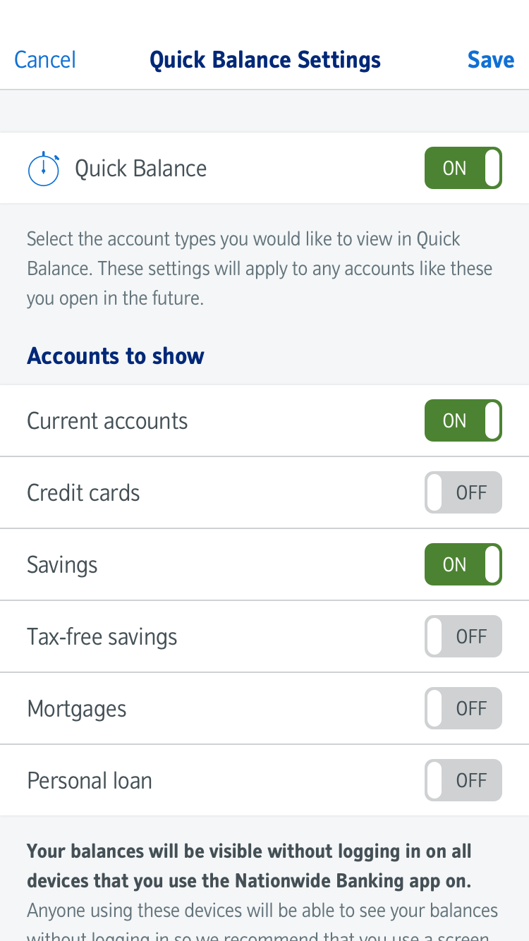
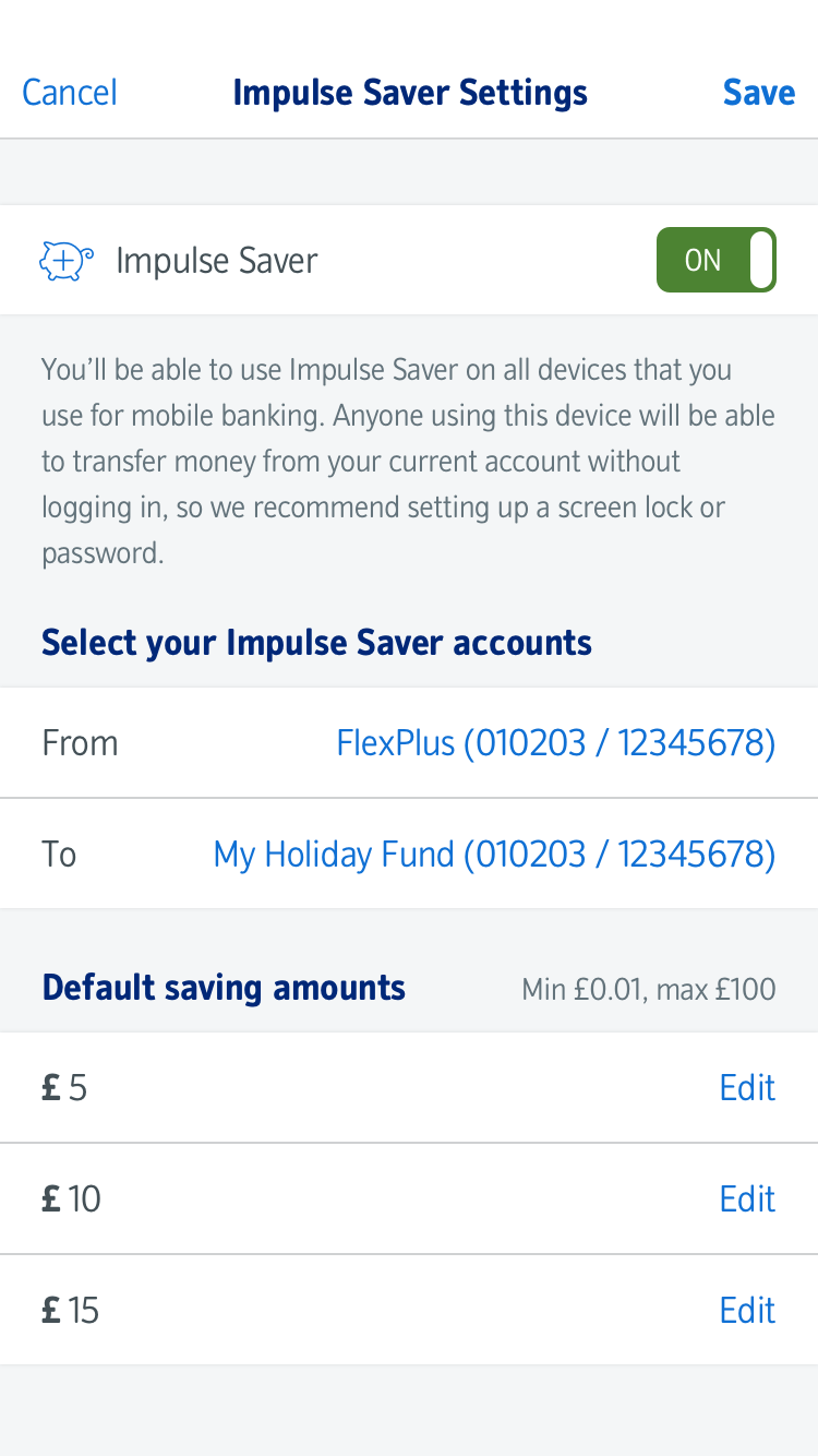
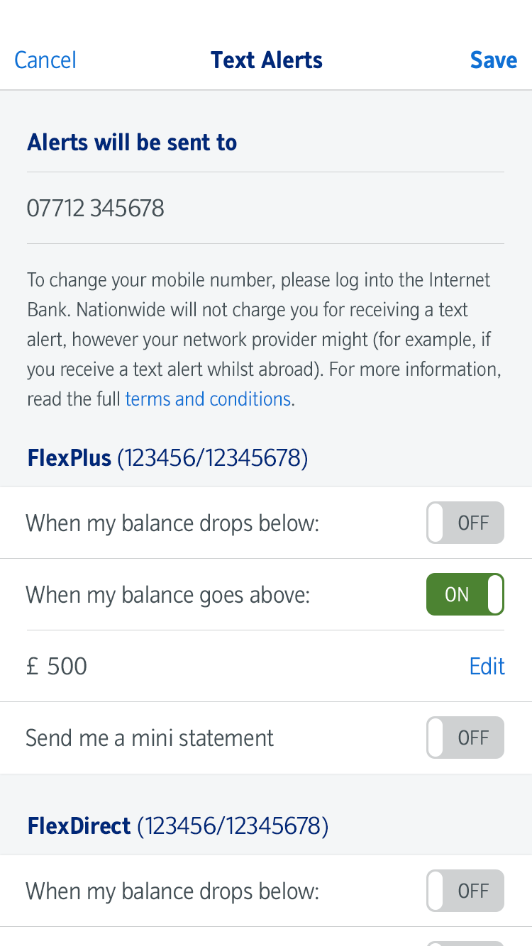
Above: Users were able to personalise their app experience.

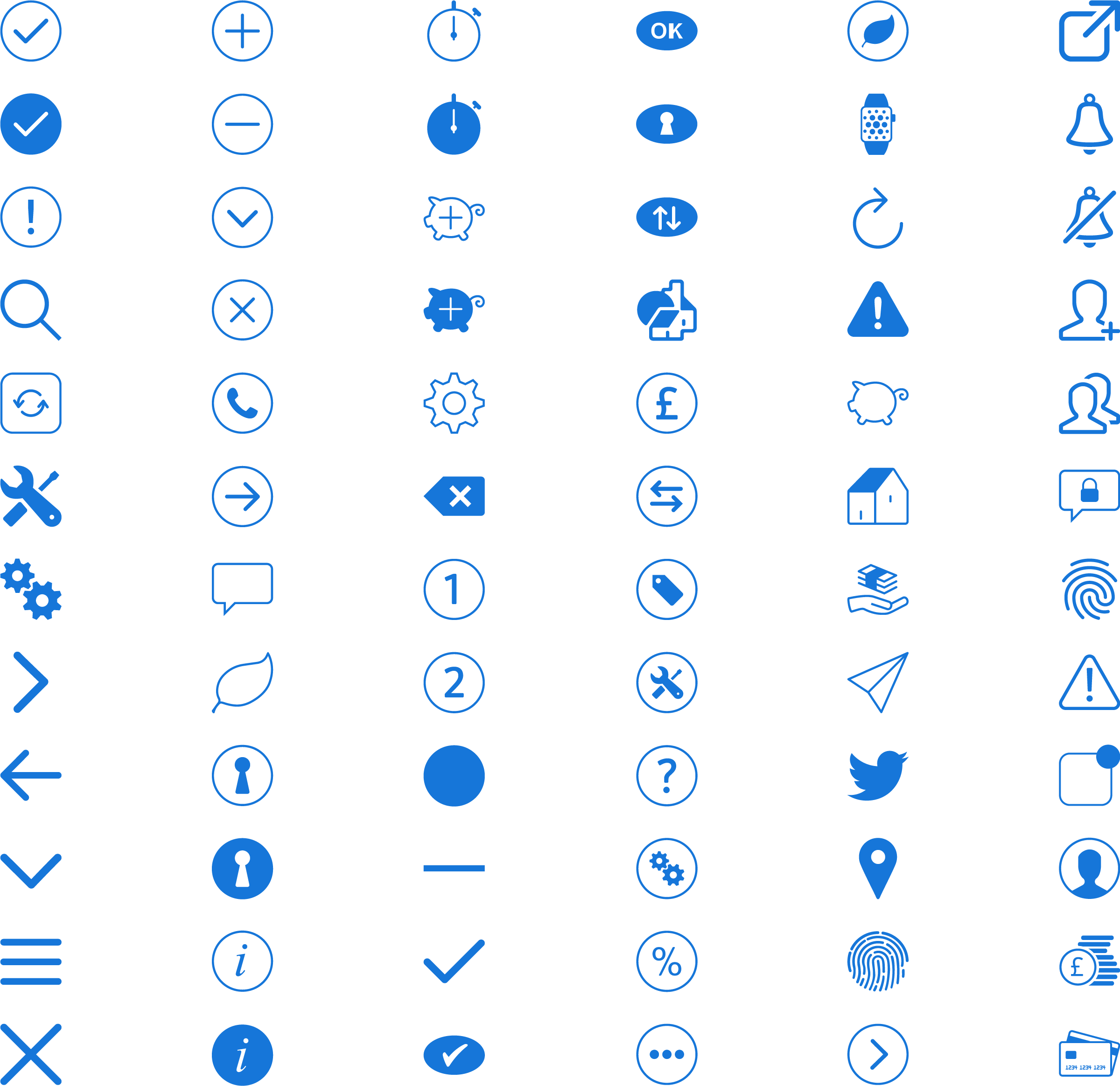
Above: I created a suite of icons for use throughout the app.

Above: The app was decomposed into a series of components and styling rules, all of which were extensively documented throughout the design process.
Launch
The new Nationwide Banking App launched in June 2016, and adoption was immediate: within the first month, 62% of customers had downloaded it. Reviews were overwhelmingly positive, and the app has continued to hold its ground, maintaining ratings of 4.5 on Android and 4.8 on iOS as of January 2021. This not only surpassed the original goal of four stars on both platforms, but also showed that a clearer, more human-centred design could make banking simpler and more rewarding for members.
Lessons learned
Design for different mental models – Some customers think “choose account first, then function,” while others think “choose function first.” By blending both patterns — with account-led navigation upfront and a function-led route in the menu — we avoided forcing one model at the expense of the other.
Simplicity beats decoration – Early visual explorations leaned too heavily into brand expression, creating clutter. Scaling back, letting content breathe, and focusing on what mattered to members gave us a cleaner, calmer experience that better suited sensitive financial tasks.
Iterate relentlessly – From journey maps to prototypes to visual design, every round of testing revealed opportunities. Small changes — like reducing login taps from five to three, or switching passcode entry from randomised to sequential — had outsized impact on ease of use.
What’s next
The launch was a milestone, but it was never the finish line. Continuous monitoring of feedback and analytics remains key to spotting friction and refining flows. The design also set the stage for future growth — from tighter integration between mobile and online banking, to more personalised experiences that anticipate customer needs (e.g. Savings Goals). The goal was never just to deliver a “new app,” but to build a platform that could evolve with Nationwide and its members.