Designing SSE Energy’s First Mobile App
I designed SSE’s first mobile app aimed at increasing the number of customers self-serving via digital channels.

Background
In late 2019, SSE hadn’t yet developed a mobile app and knew they needed one to avoid being left behind by challenger brands such as Octopus, OVO and Bulb. Basic self-service capabilities existed on SSE’s website but few customers were using it, preferring instead to call Customer Services for basic tasks such as checking balances, paying bills and submitting meter readings.
SSE rightly identified these tasks as ripe for creating a mobile app around to reduce call centre volumes but also to deliver something useful and valuable to customers.
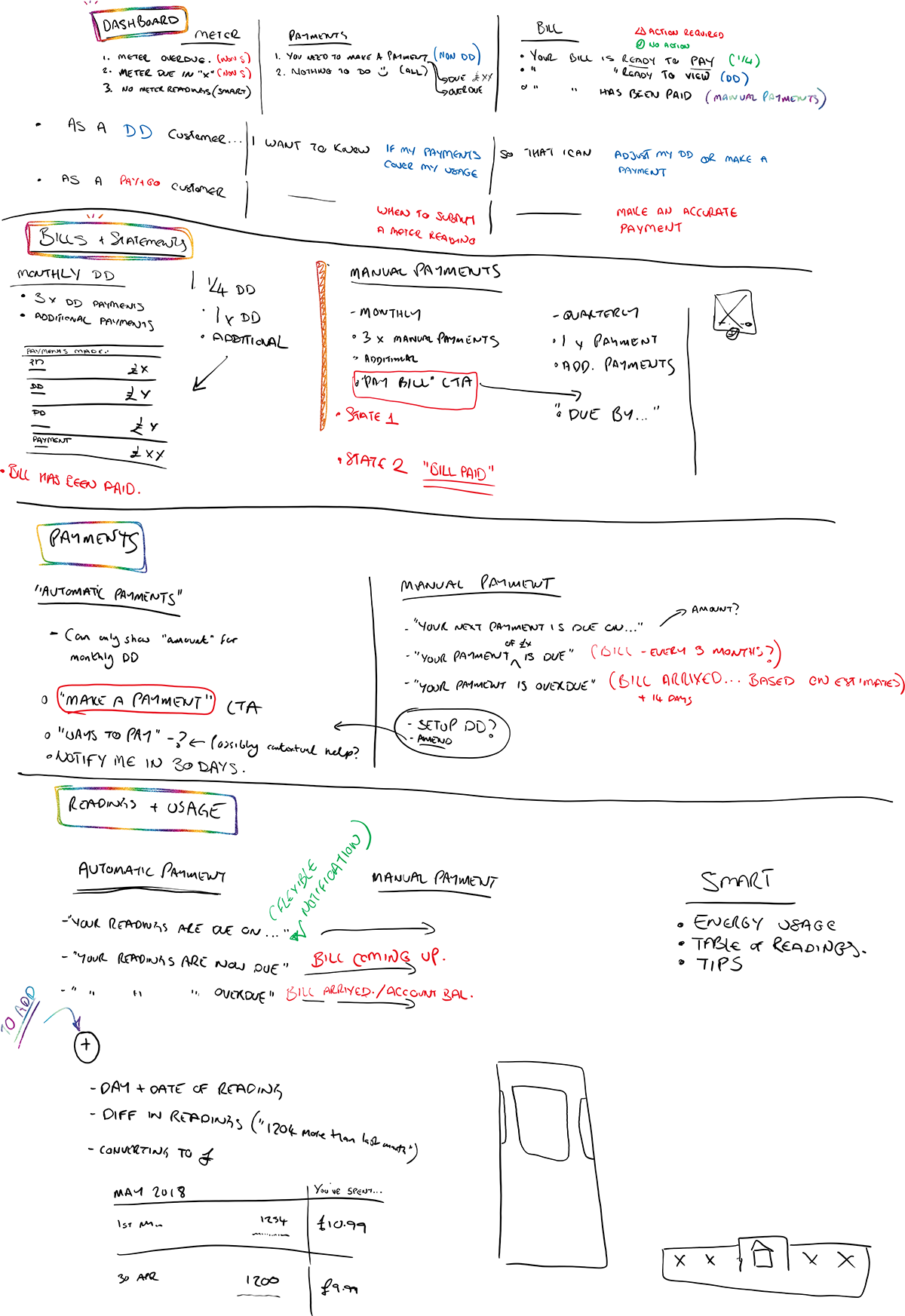
Above: Output from the discovery workshop.
Defining scope & audience
To get things started, I ran a discovery workshop with the key stakeholders to define what we wanted this app to do and who we wanted to target. Data from SSE call centres gave us three areas to focus on:
- Encouraging regular meter reading submissions. Many customers did not bother to give regular readings, meaning their energy account balance had the potential to remain unseen and incorrect for months.
- Mitigating 'bill shock’. Ignoring bills, readings or payments for any length of time sometimes led to 'bill shock’, where a customer’s bill or energy usage was higher than they expected. This would lead to the customer calling SSE for an explanation.
- Keeping customers informed about payments and balances. For most customers, their monthly payment would cover their energy usage throughout the year, leading to a nonchalant approach to managing their energy account. We surmised that we could make it easier for customers to stay on top of their energy account by removing as much friction as possible and presenting information in a clear, understandable way.
This workshop also allowed us to cover app functionality which – based in part on call centre data and website traffic analysis – was fairly obvious:
- An overview of the user’s energy account
- Meter readings and energy usage
- Payments – making and managing
- Bills
- Basic account management & housekeeping
Our core aim was to create a lean, fast mobile app that allowed users to access and manage their energy account far quicker than was possible using the existing website.
Defining the journeys with customer input
We created a short questionnaire and sent it to a subset of SSE customers to gauge their views on some of our assumptions so far. We asked about their attitudes to managing their energy account, their use of existing mobile apps to perform account servicing (not just energy based) and what kind of problems they faced trying to service their SSE account using existing digital technology. The responses affirmed our view that getting the basics right would solve most problems for most people.
We then started to define the user journeys based on this data and the existing journeys on the website. I’m a strong advocate for mapping out functionality early on, even if the journeys already exist, as I find it helps identify any holes or areas for improvement and also gives the team something to coalesce around early on.

Initial designs
I quickly put together some initial layouts showing how the app could achieve some of our objectives:
- A component on the main Dashboard summarised the state of the user’s account and showed any actions the user might need to take, covering the three core areas of the app: meter readings, payments and bills.
- Clear information on when meter readings would be needed, with the option of receiving a push notification when due.
- Clear payment and billing information, showing when payments needed to be made alongside a clear, logical breakdown of bills.

User testing
The designs were tested with users across three separate sessions, each time with tweaks and enhancements baked in. The designs tested well with participants who perceived the account management tasks to be easy to complete.
This was great feedback to take back to the business, especially when we were able to empirically demonstrate that the vast majority of participants would prefer to use a mobile app than the existing website.
Final designs
The final designs clearly share their DNA with the original concepts, with obvious refinements for usability, consistency and accessibility.
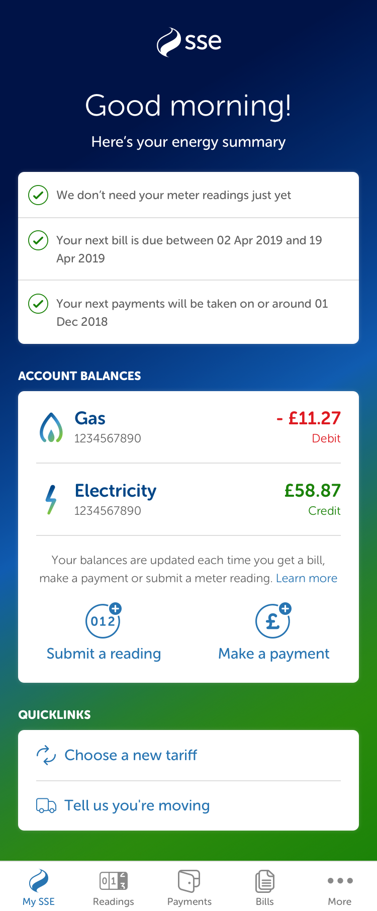
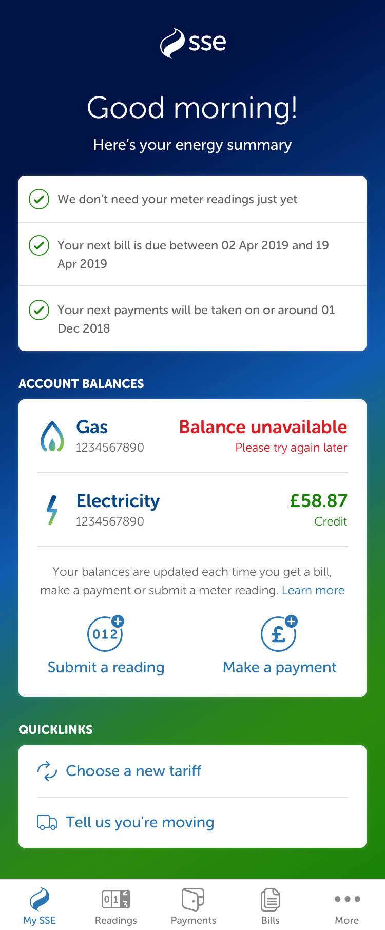
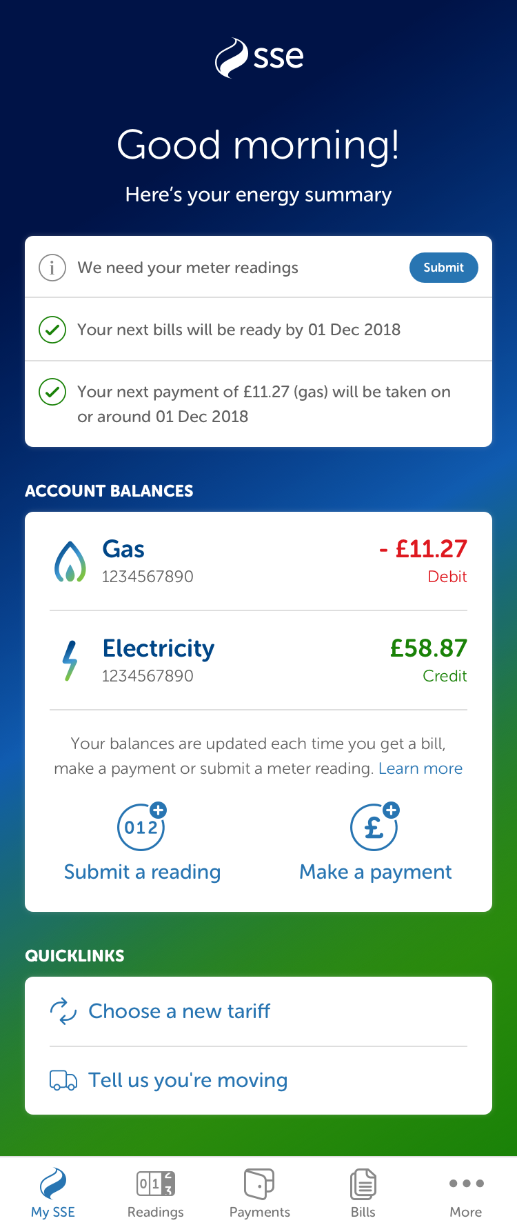
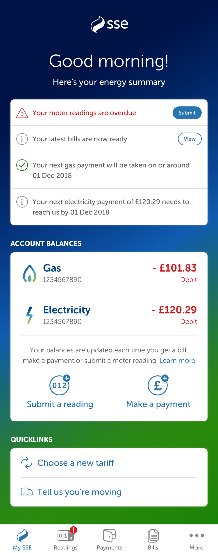
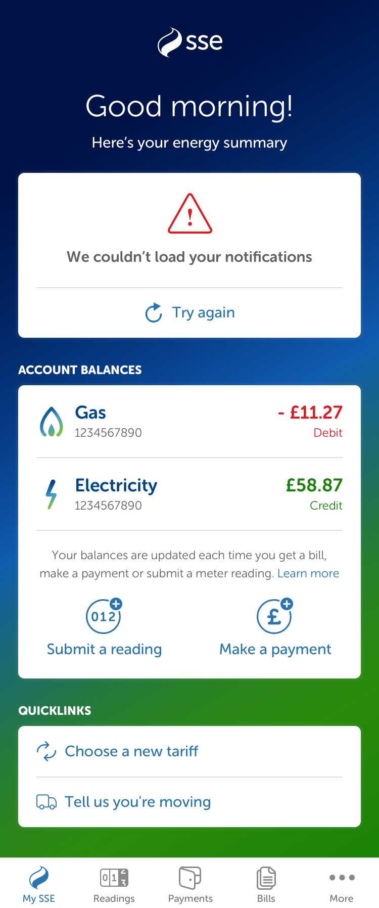
Above: The dashboard was developed to support multiple types of account and acted as the starting point for many journeys.

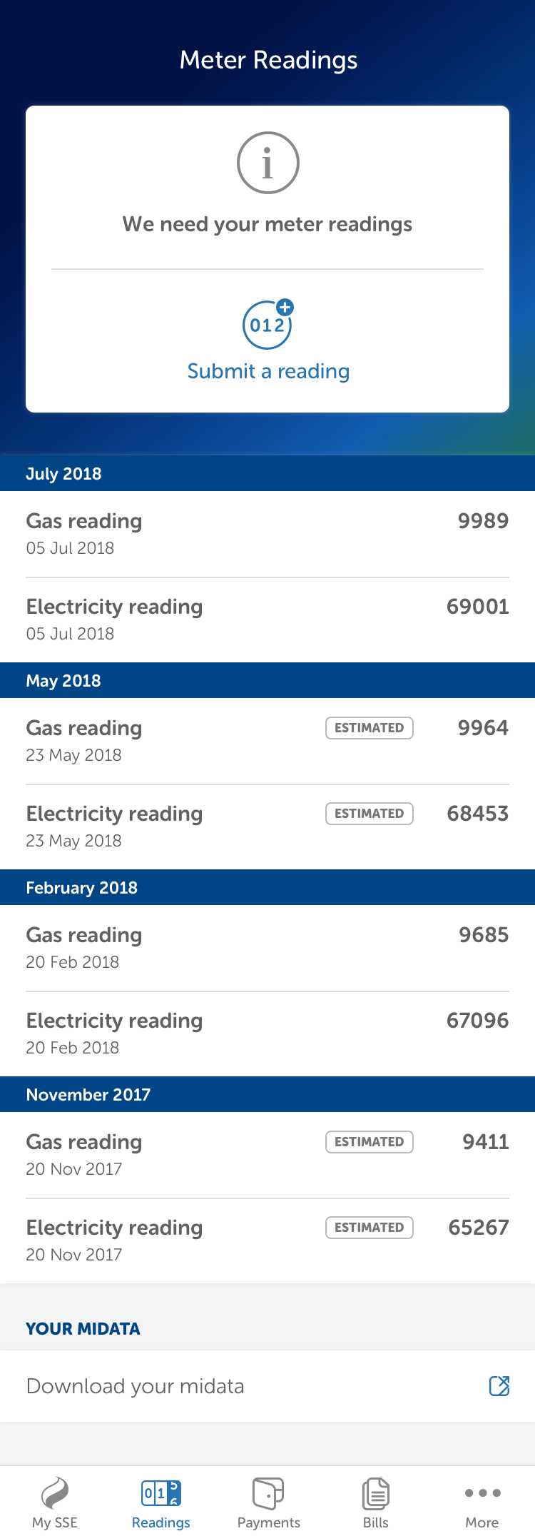

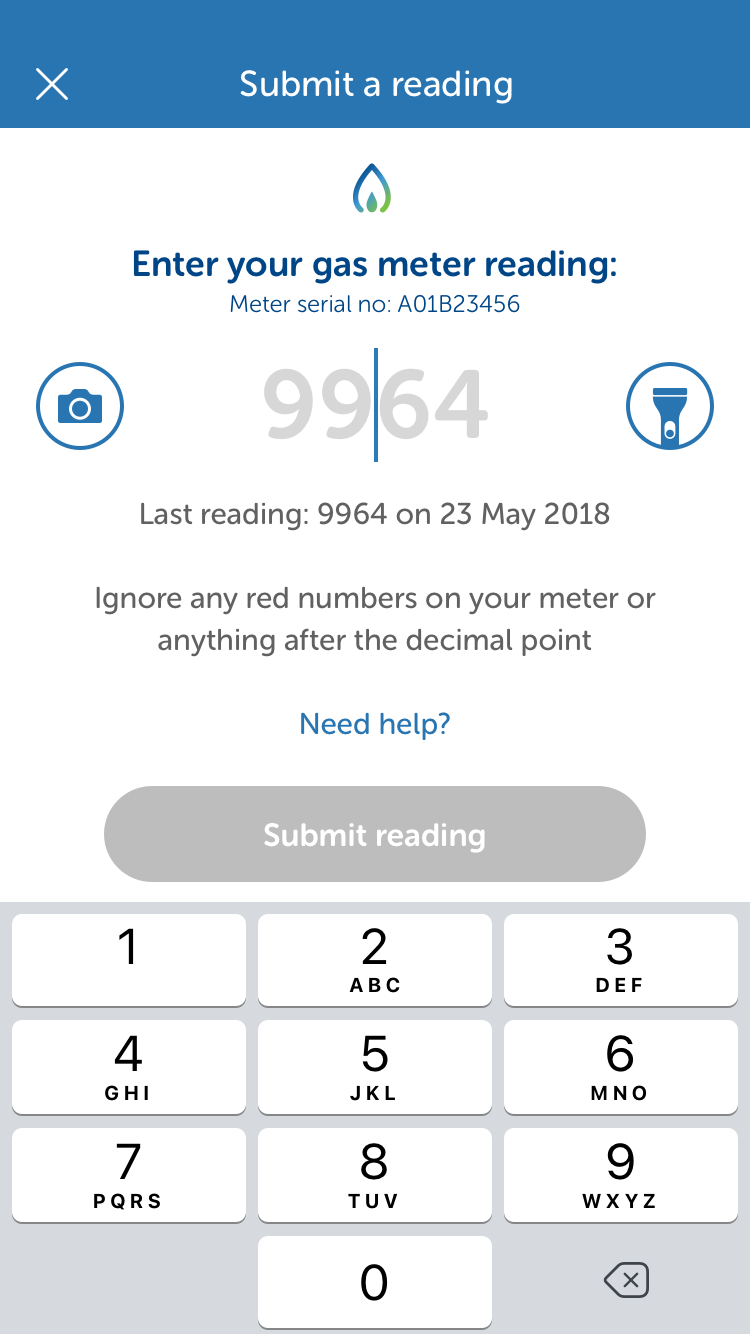
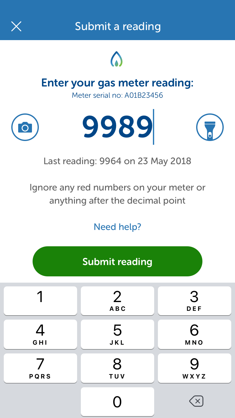
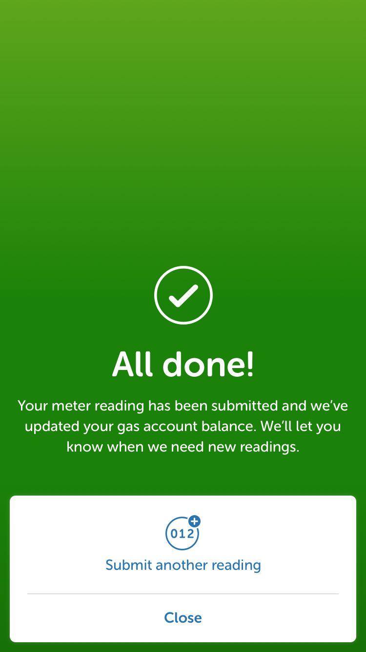
Above: The design aimed to make submitting a meter reading as fast and simple as possible.
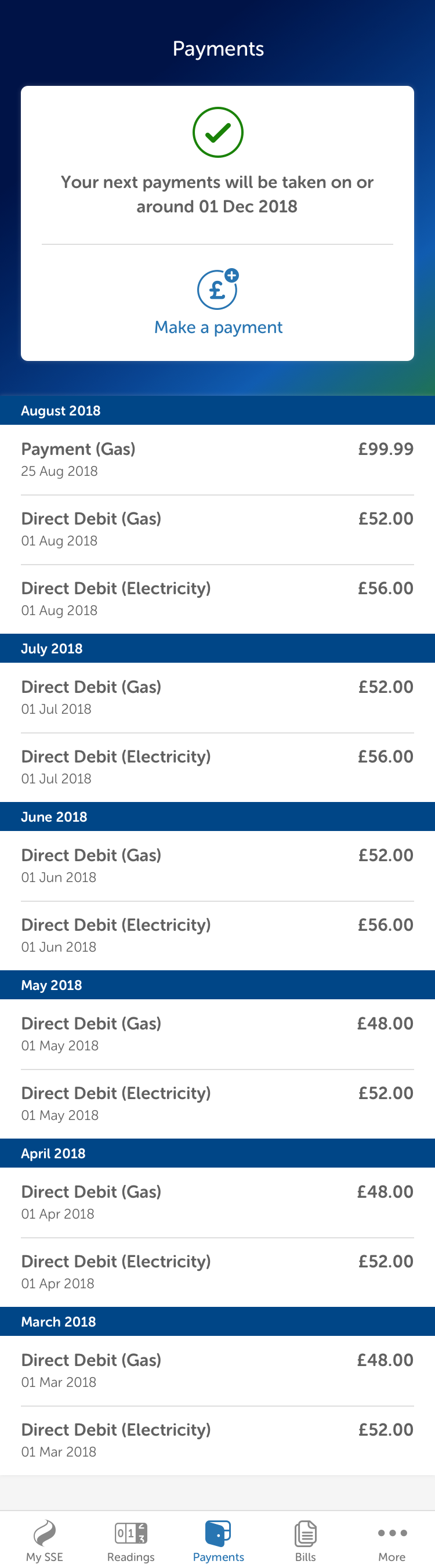
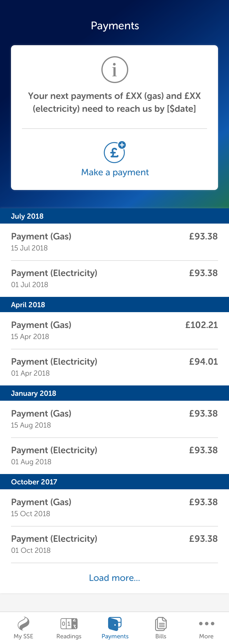
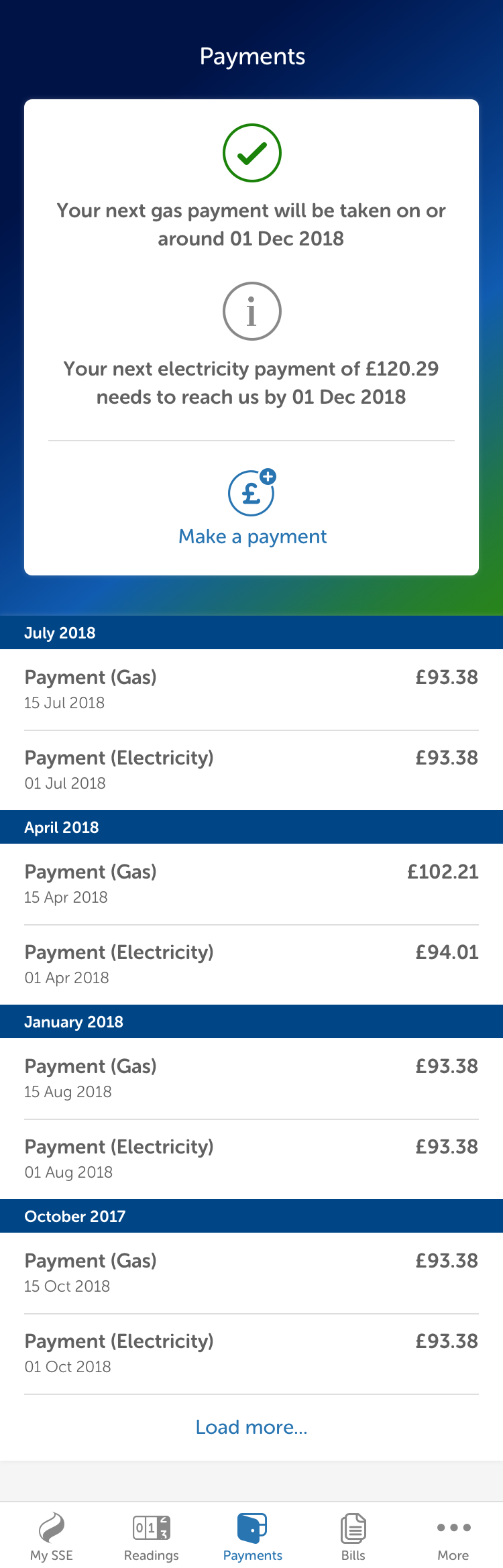
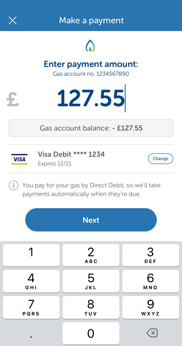
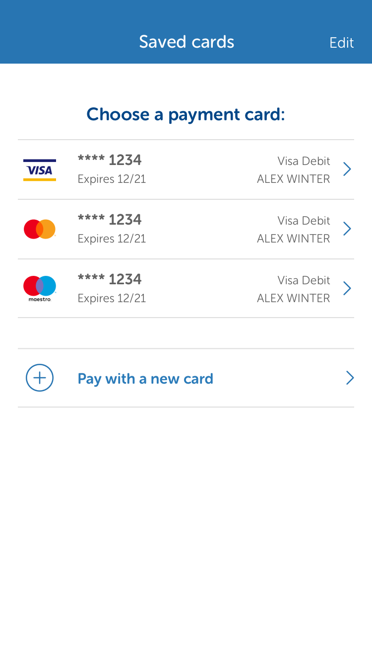
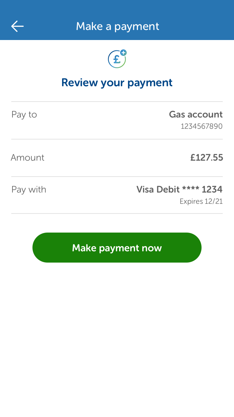
Above: The payments screens reflect the various types of fuels and payment methods the app needed to support.
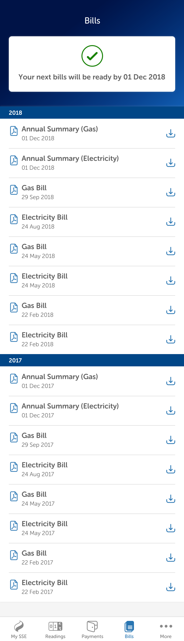
Above: For MVP, statements were presented as downloadable PDFs. Moving this information to a more immediate and accessible format was a top priority for future releases.
Launch & outcome
The first release of the app launched in early 2020. Shortly after launch, SSE Energy were acquired by OVO and development of the app halted.
As of Sept 2023, the app has average ratings of 4.2 (Android) and 4.8 (iOS).