Nationwide Building Society Responsive Website Design
A multi-year responsive redesign of Nationwide’s public website.

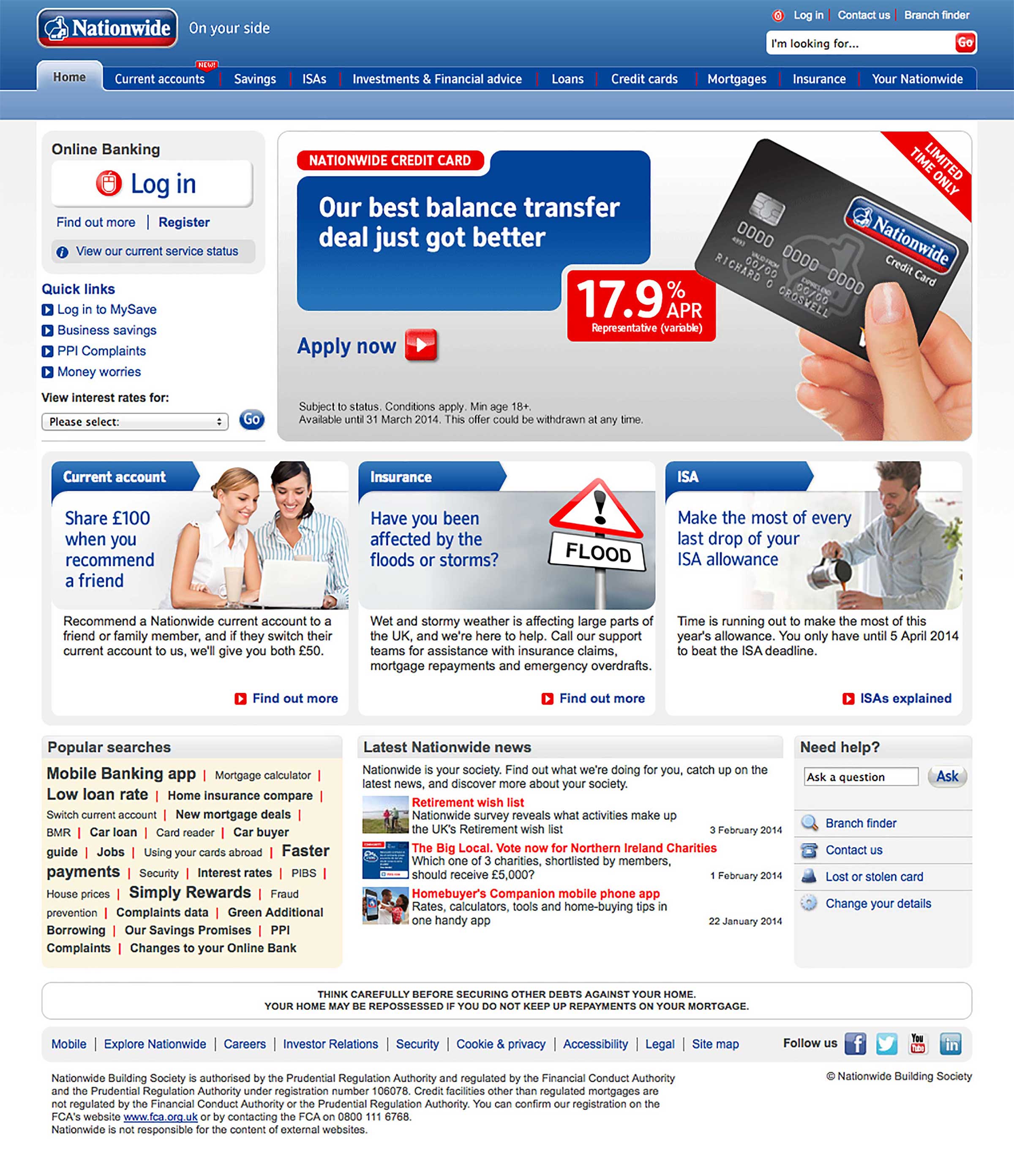
Above: Nationwide’s old website. Structure & content were mainly focused on products.
Background
In 2014, 25% of the traffic visiting nationwide.co.uk came from mobile devices. Nationwide’s previous investments in mobile-web solutions were creaking at the seams and did not offer the same experience provided to desktop users.
Additionally, Nationwide wanted to introduce new types of content to better reflect the relationships they had with their customers. As one executive put it, “For many years, our website was largely a shop window advertising the latest rates. We wanted to break that mould.”
I led the redesign effort with the goal of creating the UK’s first responsive Financial Services website.
Catering for different types of content
We developed a new IA for the site to house the types of non-product content Nationwide wanted to add. The revised structure had a mix of product, support and guidance content to facilitate more meaningful journeys across the site.

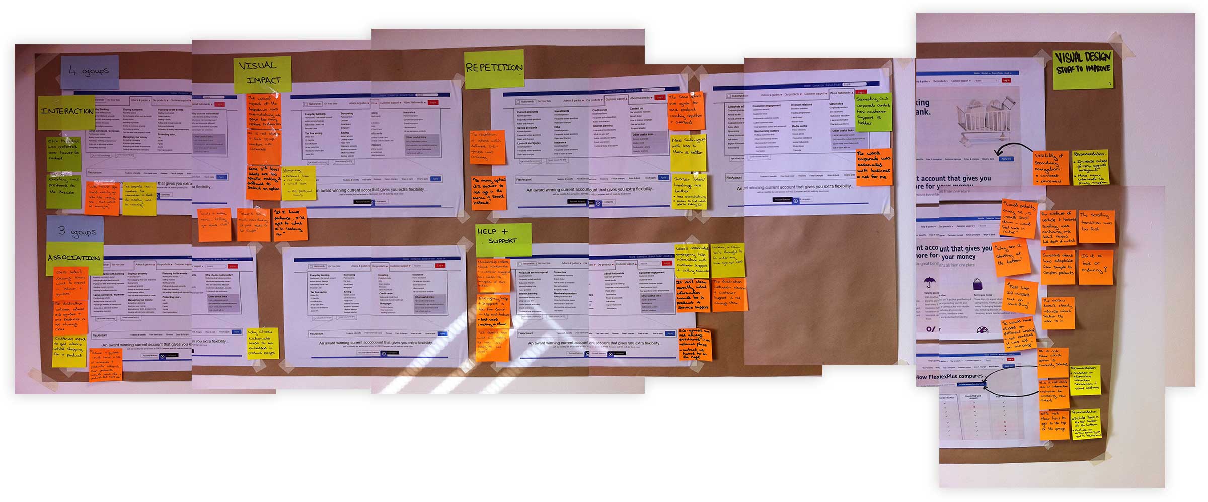
Testing the new structure with customers
One of the fundamental requirements of this new structure was that it could not hinder product acquisition: if products were harder to find and/or buy, then the IA would be a failure.
We tested the new structure with customers, ensuring that products were readily findable and tweaking as necessary. We also noted that users were receptive to the idea of non-product content being on offer.
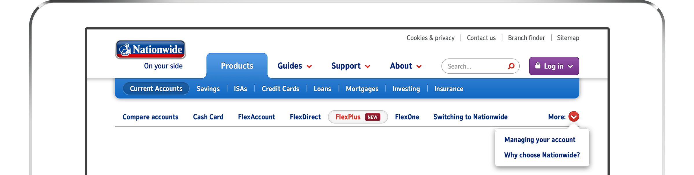
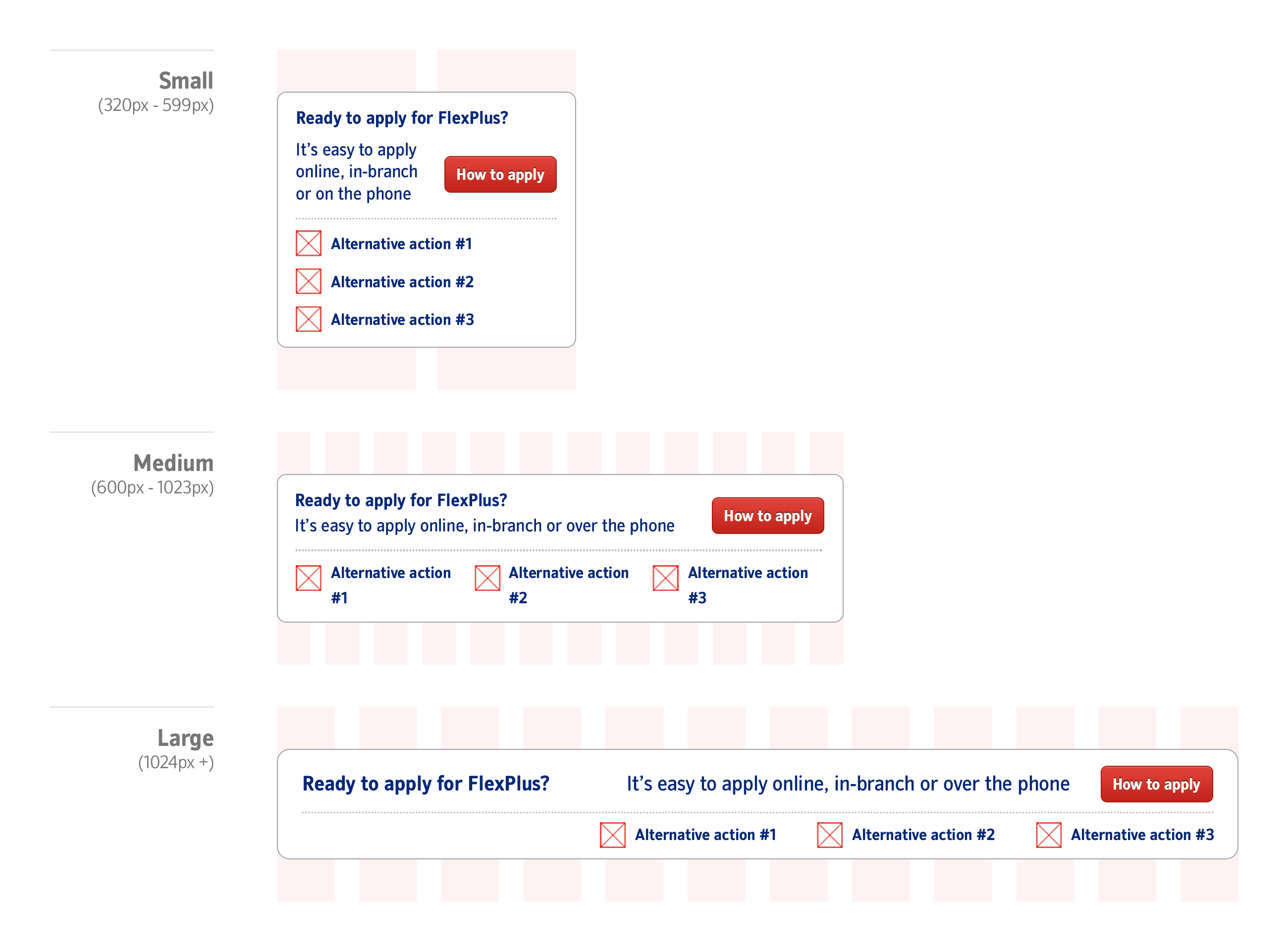
Designing the new navigation
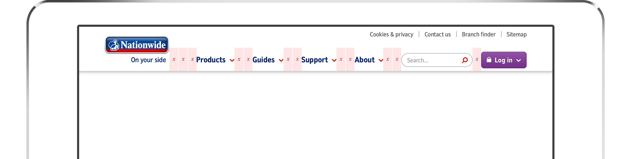
The revised structure added an additional layer into the navigation, so the design would need to support four levels of navigation.
Above: Masthead spacing & primary navigation.
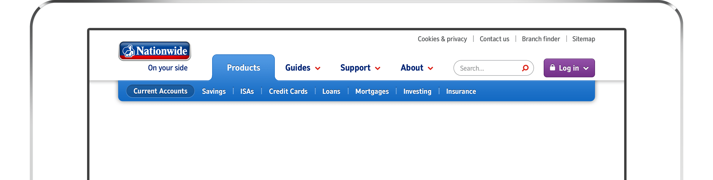
Above: Secondary navigation.
Above: Tertiary navigation.
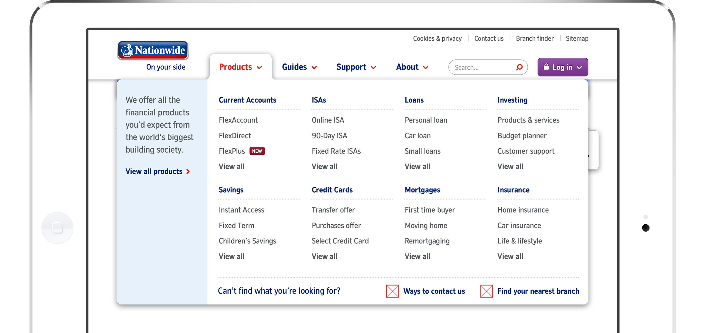
Above: navigation menu.
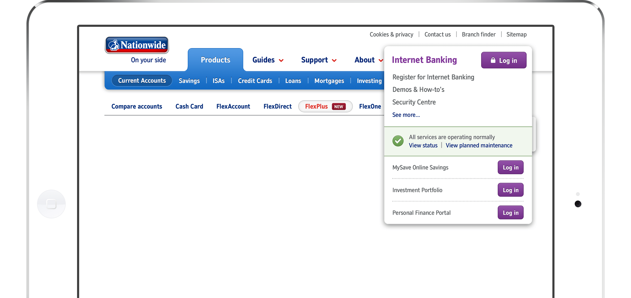
Above: Log in menu.
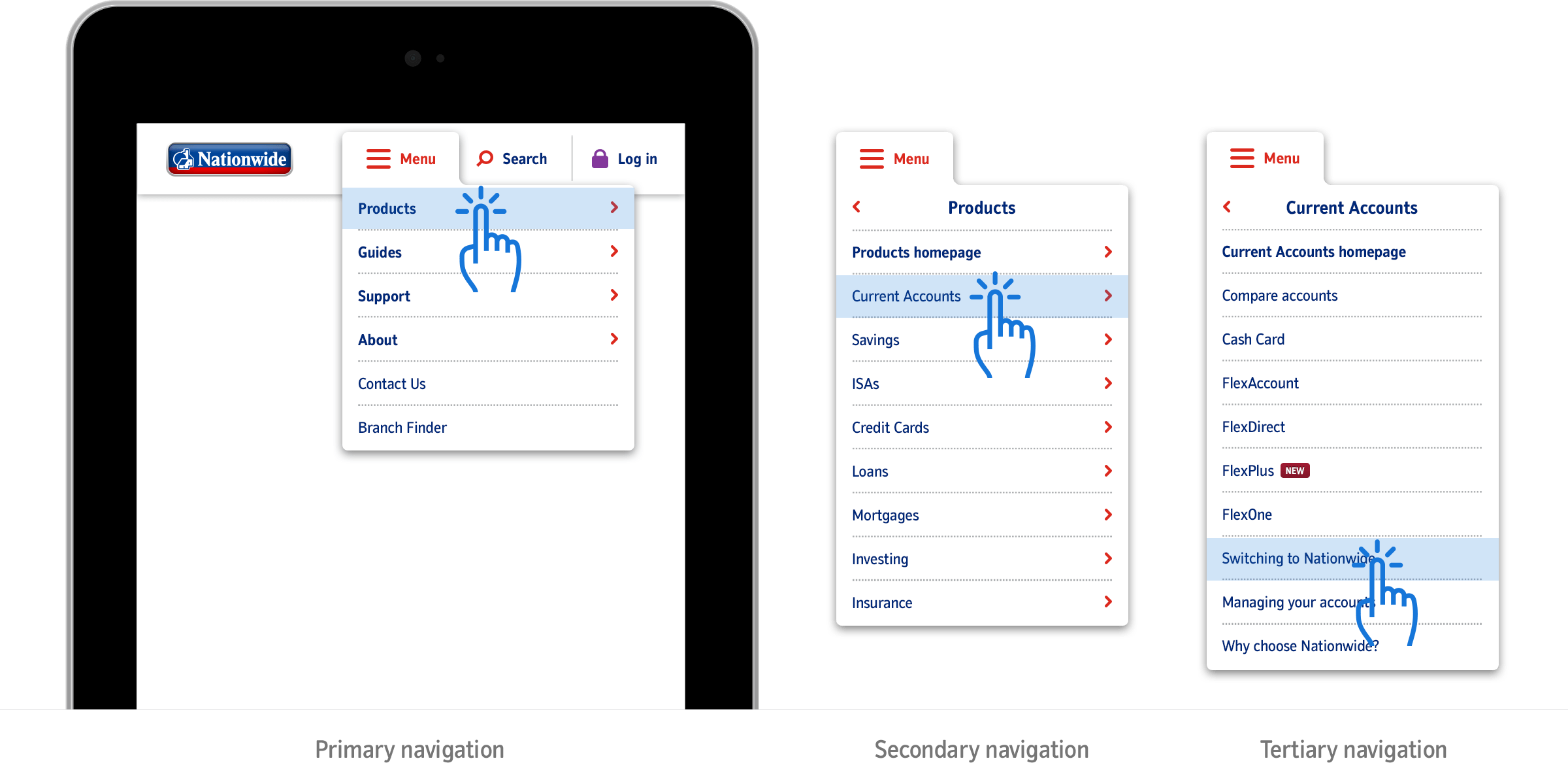
Above: On smaller viewports, navigation took the form of a single cascading menu.

Above: As the viewport shrinks, the quaternary navigation degraded from in-page tabs to show/hide accordions.
Designing the core templates
I designed the templates for the main sections of the site at three breakpoints; not only did the designs help the whole team understand how the site would behave as the viewport scaled but they were instrumental in socialising the new design around the business.


Components, not static page designs
We disseminated a series of components from these main template designs, and worked with the business to identify more components that we felt might be required to create the final site.
The new site would be powered by a Sitecore CMS and, together with the component-based approach, would allow the business to create new pages quickly and easily.

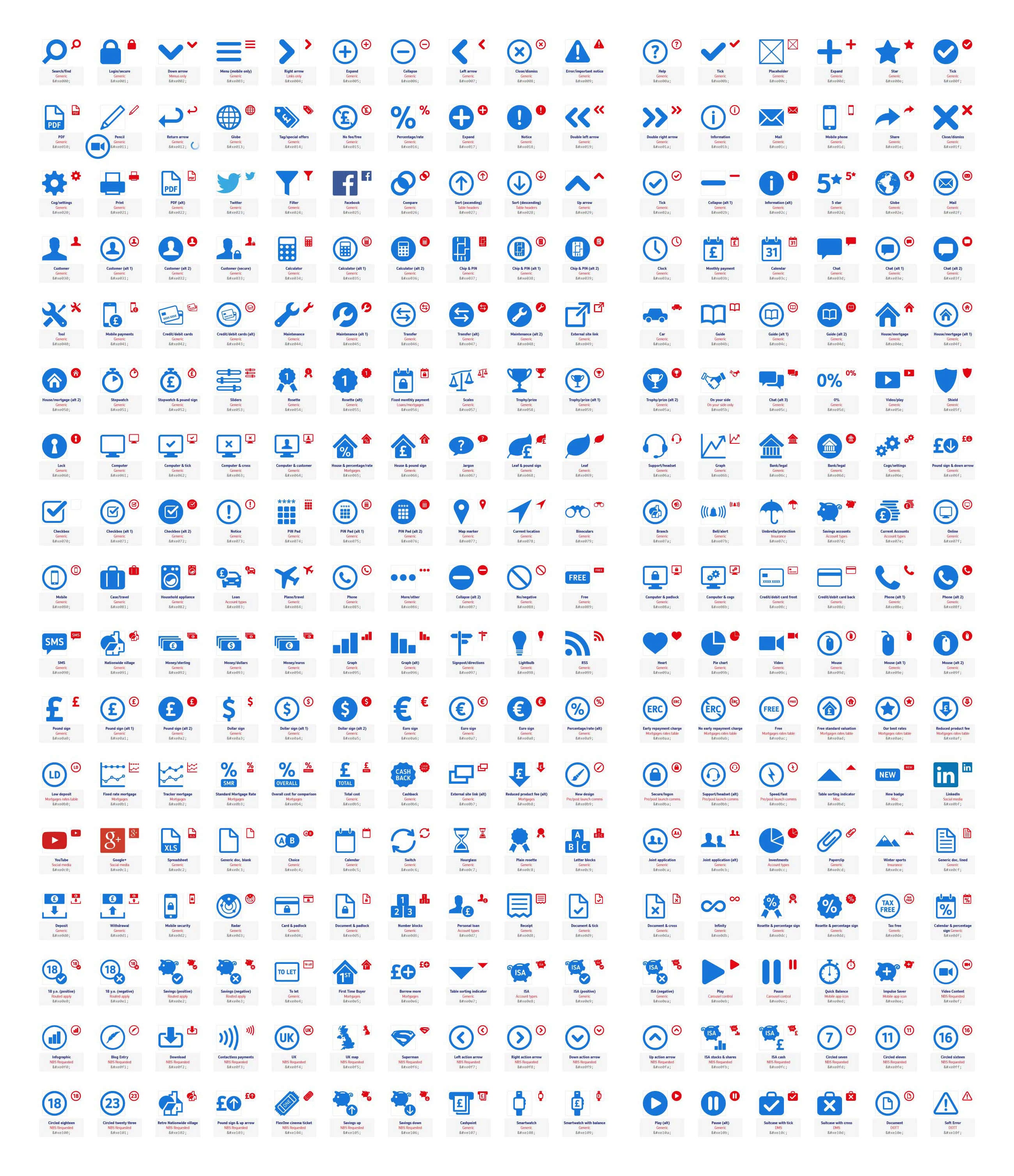
Icons, icons, icons
To bring product content to life, I designed a set of icons to better portray the features & benefits of each.
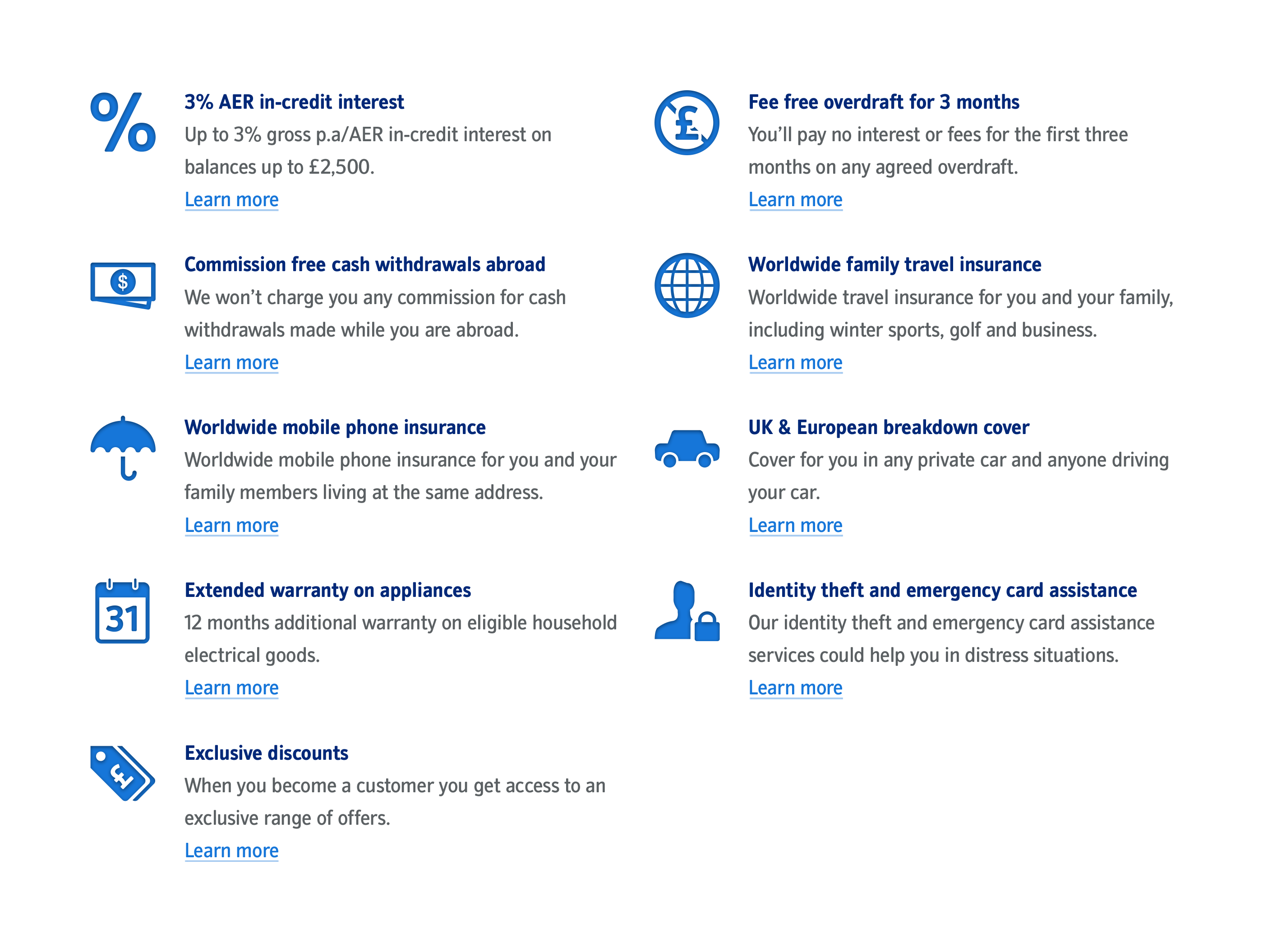
Tools & calculators
All the tools and calculators were redesigned, making use of touch-inputs where appropriate. I worked closely with the developer to ensure that sliders worked as we wanted them to on touch devices.
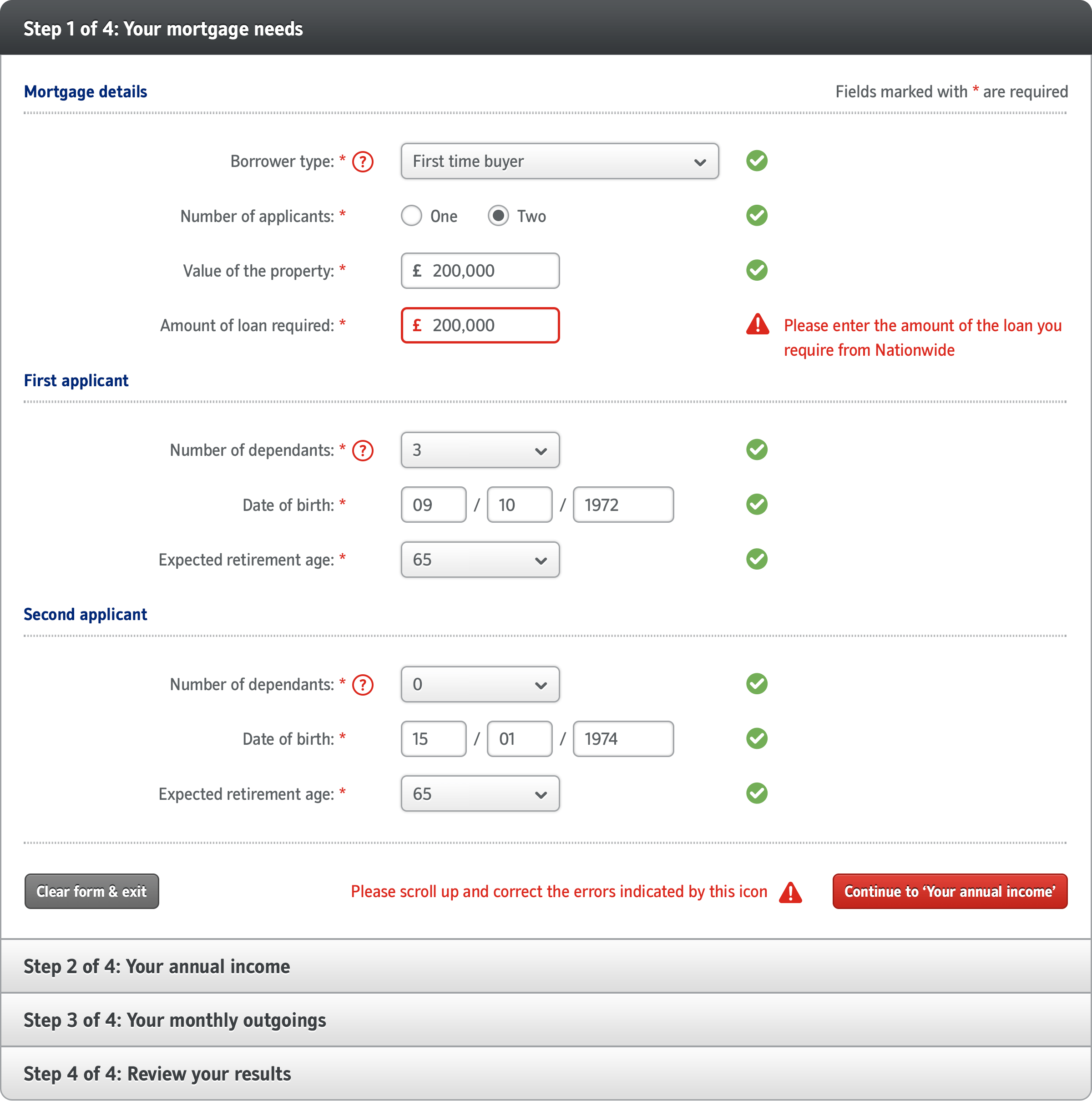
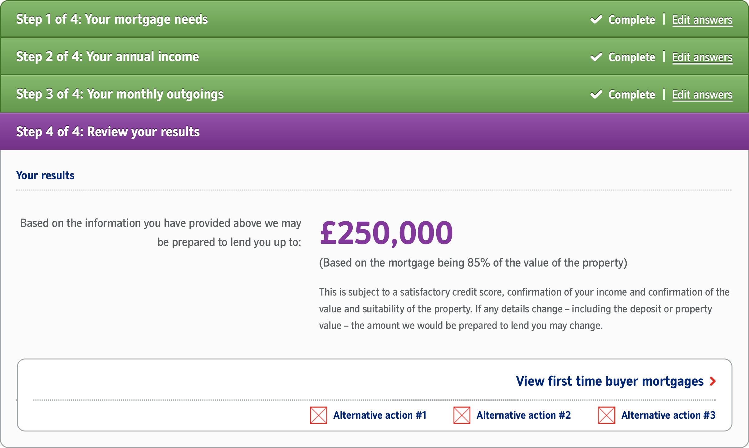

Above: Existing tools were redesigned and new tools were created as part of the redesign. This is the mortgage affordability calculator.

Above: Credit card benefits calculator.

Above: Personal loan calculator.
Maintaining the design
To help with the implementation and ongoing maintenance of the site, I created a comprehensive set of documentation outlining the design principles underpinning the site plus the methods and components available to content creators.

Launch & outcome
The site was successfully launched in early March 2014 and was the first responsive website from a major UK Financial Services provider (goal achieved!). Additionally, it was the first website that moved away from the more conservative design & content themes prevalent in the industry at that time.
The website won the ‘Best Financial Services’ award at the Sitecore awards in 2014.