ANZ goMoney Banking App Redesign
A universal visual design language for ANZ’s mobile banking app for iOS & Android.

Background
ANZ goMoney is ANZ’s banking app. In 2013, ANZ decided to move away from separate native builds for iOS & Android in favour of a single ‘hybrid app’ codebase. This represented an opportunity to create a new design for both platforms, and I worked with ANZ to create this new unified visual design language.
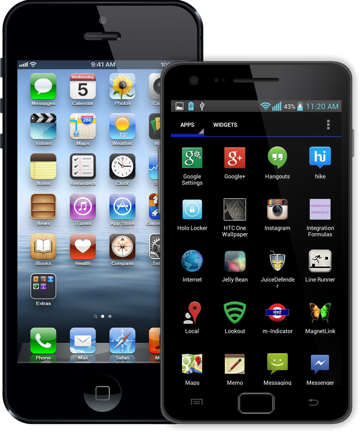
Above: iOS 6 and Android 4.1, two very different aesthetics.
The design challenge
Whilst the strategic & operational benefits of this shift were obvious, it did come with a major design trade-off: creating a single design that felt at home on two very different platforms.
At the time, iOS (version 6) still had a very shiny aesthetic, and used skeuomorphism throughout. By contrast, Android (version 4.1 ‘Jelly Bean’) was much flatter and simpler. Navigation was different on both platforms (e.g. Android had a dedicated ‘Back’ button, iOS did not) and used UI components that were unique to each platform.
Down to the smallest detail, these were two very different platforms and each had their own user base who were used to them; how things worked, how things looked.
Creating a single design that would work — aesthetically, navigationally, logically — on both without alienating either user base was quite a challenge.
The best of both worlds
I set out to create a design that combined what we felt were the best conventions from both platforms. Take visual affordance, for example: if you were to imagine a spectrum of affordance, with Android (flat) on the left and iOS (skeuomorphic) on the right, my design was aimed squarely in the centre of the two.
I borrowed the navigation paradigms from Android and paired it with the dialog box standards of iOS. And by applying the ANZ brand on top of all this, we ended up with a unique design that felt at home on both platforms.

Getting buy-in for the new designs
Within the business there were advocates for each platform and some skepticism about whether a unified design language would work. I involved stakeholders in the entirety of the design process, presenting ideas & rationale, fielding questions and taking onboard feedback.
This culminated in large design presentations to the entire project team in workshops in Singapore and then Melbourne.

Above: Registration, the first interaction a user has with the new app.

Above: Login via a 4-digit PIN (the iPhone 5S & Touch ID were 6 months away!).

Above: Most functions were invoked from the primary navigation which sat ‘underneath’ the account & transaction level.

Above: The transactions screen was the most complex one in the entire app, taking into account functionality, character & amount limits and density of information. This took a long time to get right!

Above: Manage payees.

Above: For both the payments & transfers processes, my aim was to be as consistent as possible: from, to, amount, done.

Above: The ‘from’ and ‘to’ accounts were selected using custom spinners. I worked closely with the developers on an early technical spike of this component to check that the hybrid codebase would give us the interaction performance we wanted.

Above: App preferences.

Above: The old app’s branch & ATM finder was only available after login. I successfully argued that this functionality should be surfaced much earlier, meaning users no longer needed to log in just to find a branch or ATM.
Documenting the app
To aid sign-off & app development, I created an extensive set of design documentation which outlined every screen in the app, process by process, including all errors and edge cases.
