Nationwide Building Society Optimised Online Applications
A set of responsive, optimised application processes for Nationwide’s Current Accounts and Credit Cards.
Launch prototype
Background
The online account opening process at Nationwide hadn’t changed in years and was loosely based on the branch account opening experience — lots of screens, lots of questions, dubious usability and atrocious accessibility.
One of those “nobody’s ever really looked at it, that’s the way it’s always been” kinda things.
I worked with Nationwide in 2014 to optimise the application processes — first for Current Accounts, then for Credit Cards. The idea was simple: make it easier, faster and more enjoyable to open an account online and more people are likely to do it.
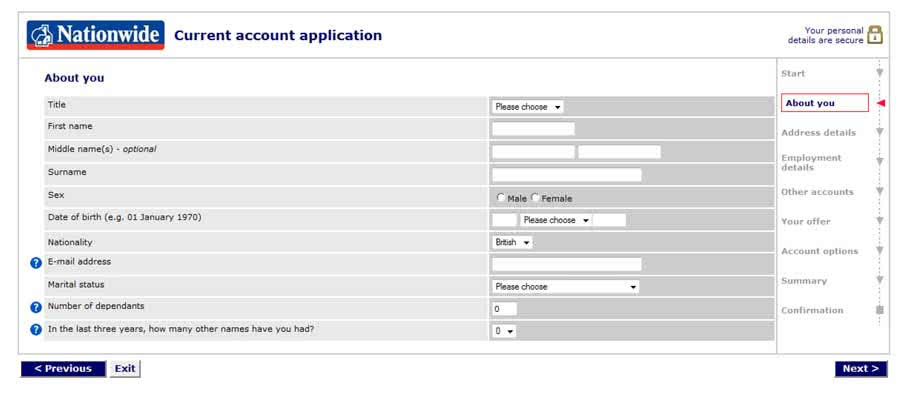
Above: An example of the old form style.
Understanding the existing processes
The first step was to look at the existing processes, gain an understanding of the logic, flow and structure and then ask a bunch of questions: Do we need to ask that? Why are we asking for that in this way? Why are we asking for that at this stage? Why didn’t we ask that over here?
As we dug deeper, interdependencies, product variations, security requirements and system limitations became clear. By the end of this phase we had a good understanding of the bare minimum questions we needed to ask to open the product for a customer.
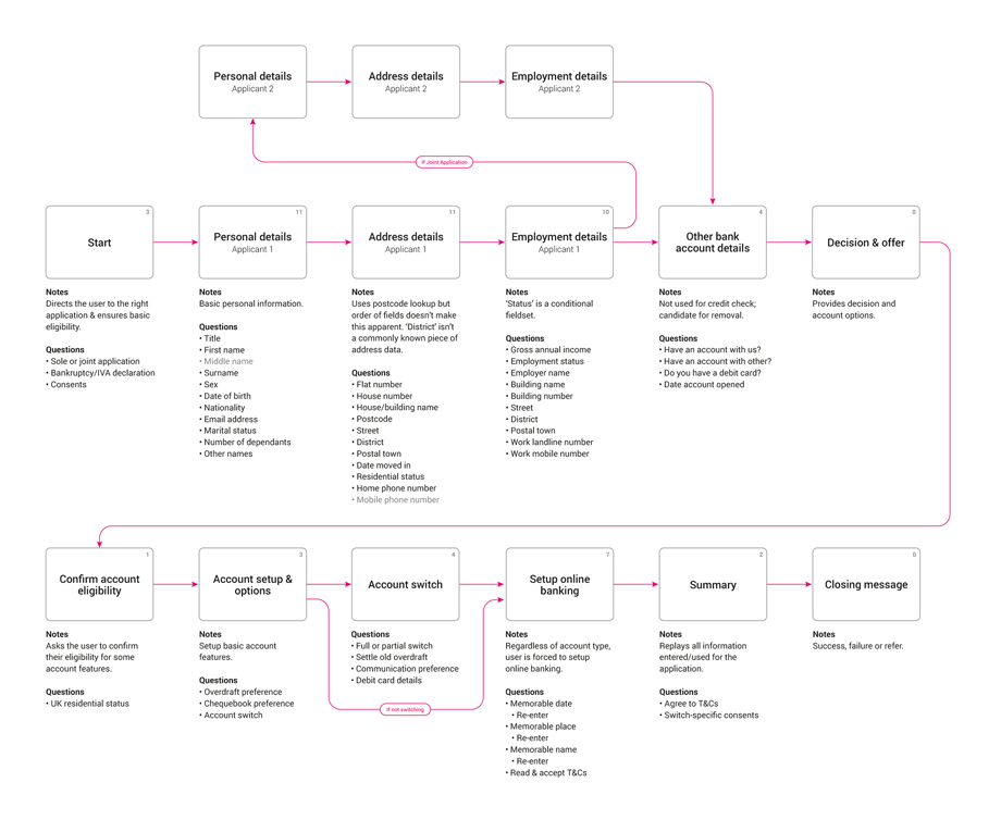
Above: The old Current Account application process which asked the user for 56 pieces of data. We challenged each question: if it wasn’t required to get an outcome for the customer, we removed it.
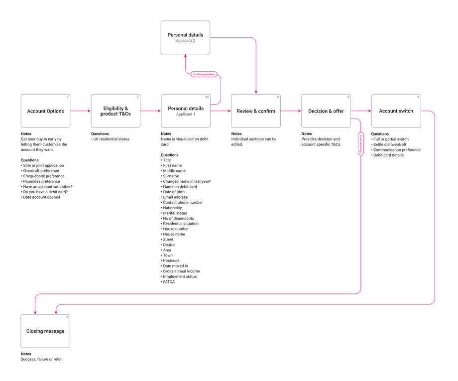
Above: The revised Current Account application process. We reduced the number of inputs required to get an outcome for the user to just 36.
Validating the new process with users
Once we had a candidate process, we worked up a quick wireframe prototype to test with. We ran three rounds of testing on the new process, iterating each time based on feedback and suggestions from users. By the end of testing we had a proven, more efficient process ready to suggest to the business.
Making questions easier to answer
The old process had a lot of instances where simple data was asked for in a clumsy way, a relic of how the data would be submitted and stored to the backend systems and, again, something that had never really been challenged. Combined with poor — or, in some cases, completely absent — keyboard accessibility, answering questions was far harder than it needed to be.
I reworked how questions were answered with a focus on ease of use, accessibility, speed and a ‘human-first’ approach. Our aim was to emulate the personal, human experience a customer would experience if they were to open an account in branch, face to face.

Above: The old process had a lot of instances where simple data was asked for in a clumsy way. For example, entering your date of birth required at least four taps/clicks (not including keyboard taps).
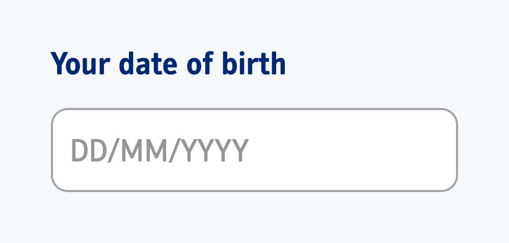
Above: The reworked date of birth question & input field, requiring just a single tap to answer. I was able to simplify a lot of the inputs in this way.
Banishing tooltips
Throughout the application process, tooltips had become a crutch for poor or unclear questioning. Too often we found a question that the majority of users would want more clarity on, only to find that clarity hidden behind an inaccessible tooltip.
I reworded each question, making sure each one was clear, concise and descriptive. I eschewed the concept of ‘hidden help’ and made questions as detailed as they needed to be.

Above: Many questions were not obvious to answer for most users. Help — of questionable quality — was only available by clicking the blue question mark icon.
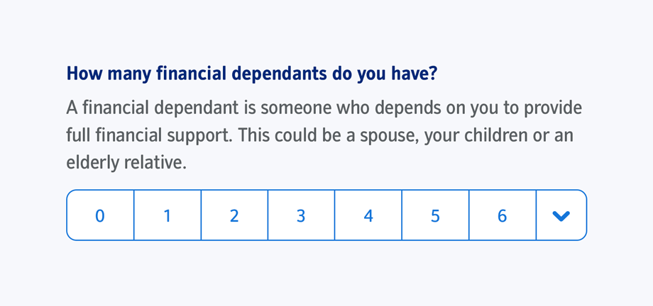
Above: I did away with tooltips. If a question needed more text to fully explain itself, I put it on-screen.
Finger friendly inputs
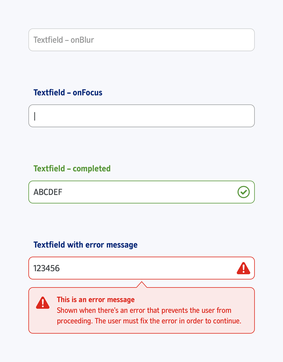
I designed all inputs to be finger friendly, accessible and consistent. All elements had the same height and spacing to create a comfortable vertical rhythm as the user went down the page filling them in.
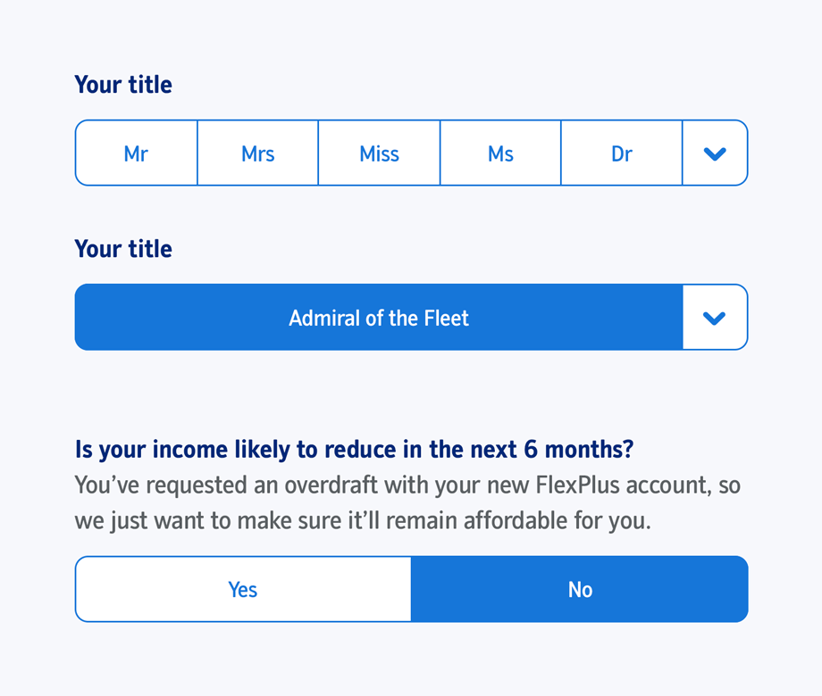
Above: I did away with tooltips. If a question needed more text to fully explain itself, I put it on-screen.
Help delivered with minimum friction
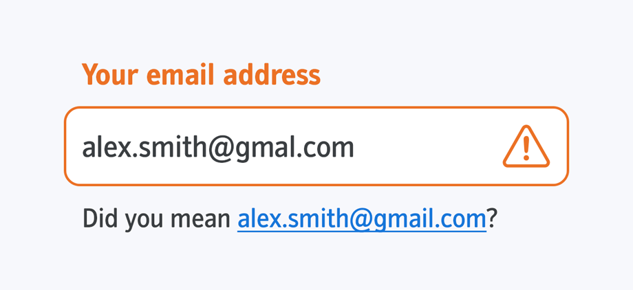
For some commonly-mistyped fields, the old process asked for the data to be input twice and would throw an error if there was a mismatch. This felt cumbersome and placed all the onus on the user.
I proposed the concept of ‘soft validation’, whereby we’d create a whitelist of common mistakes, add it to our validation rules and use it to gently ask the user if their input was intentional.
Creating an engaging experience from the start
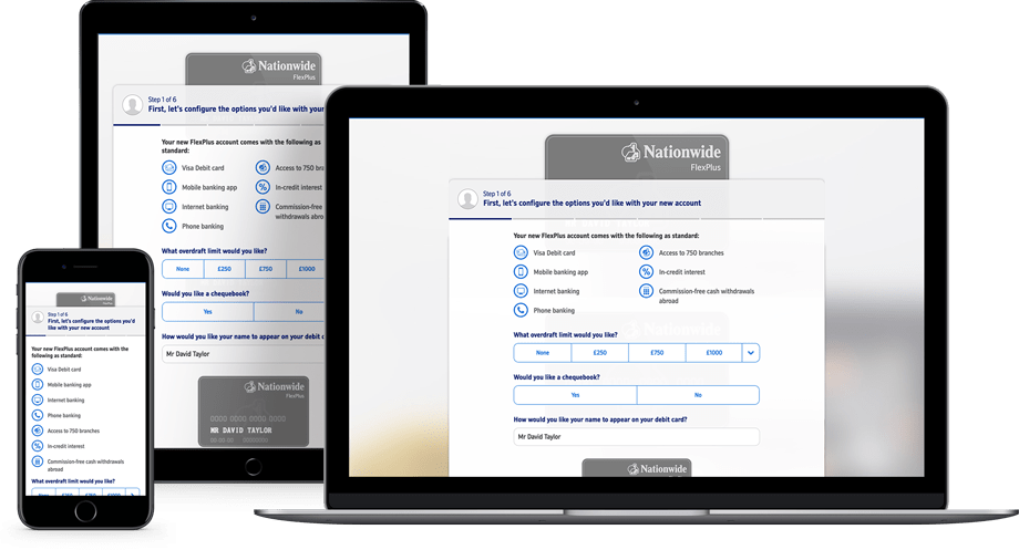
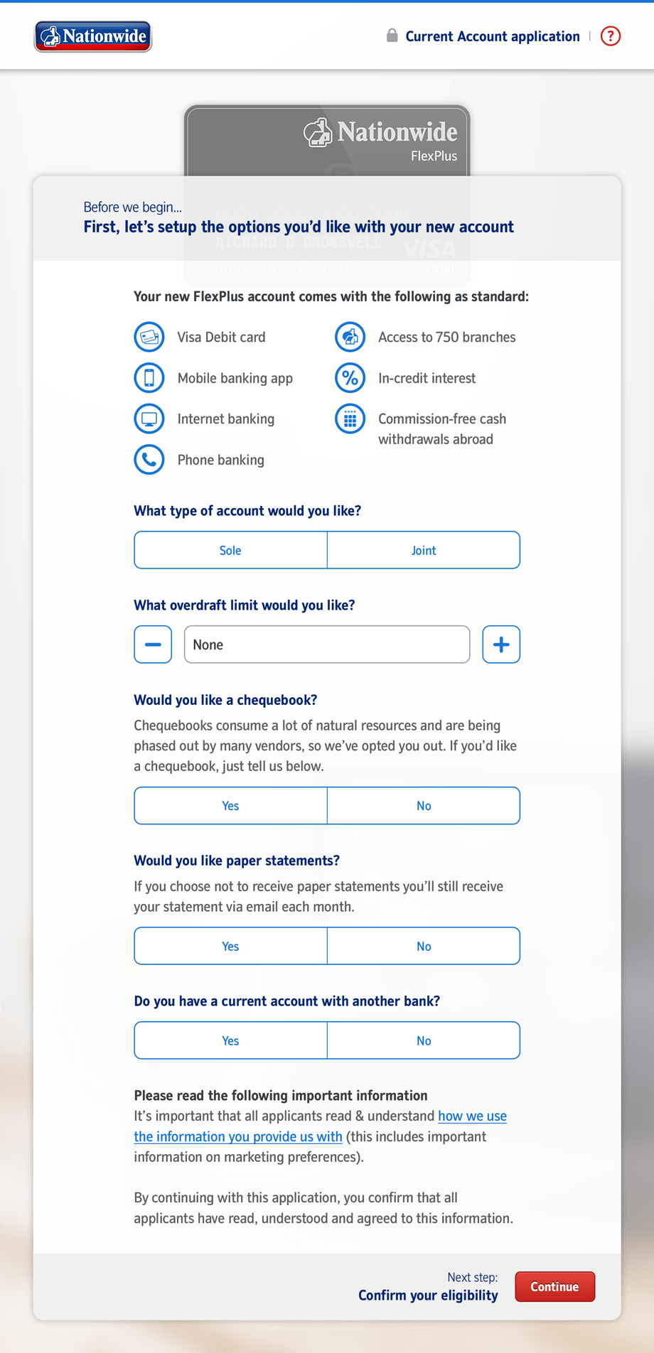
We wanted to minimise dropoff, so I designed the account configuration screen as one of the first ones a user experienced. By making this the first screen of the application, we created some user investment, the logic being you’re far more likely to continue to apply for something you’ve already customised.

Documenting the process
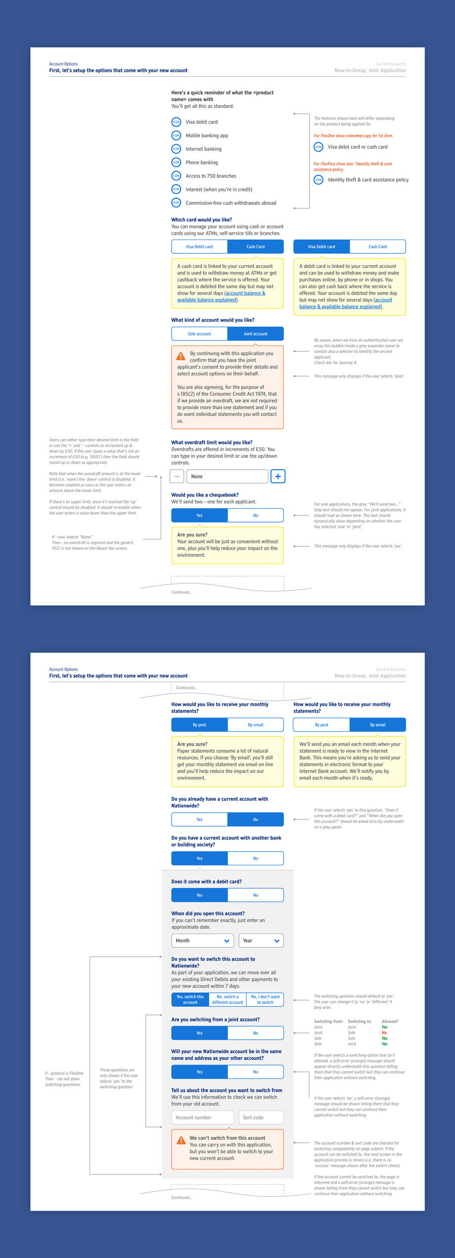
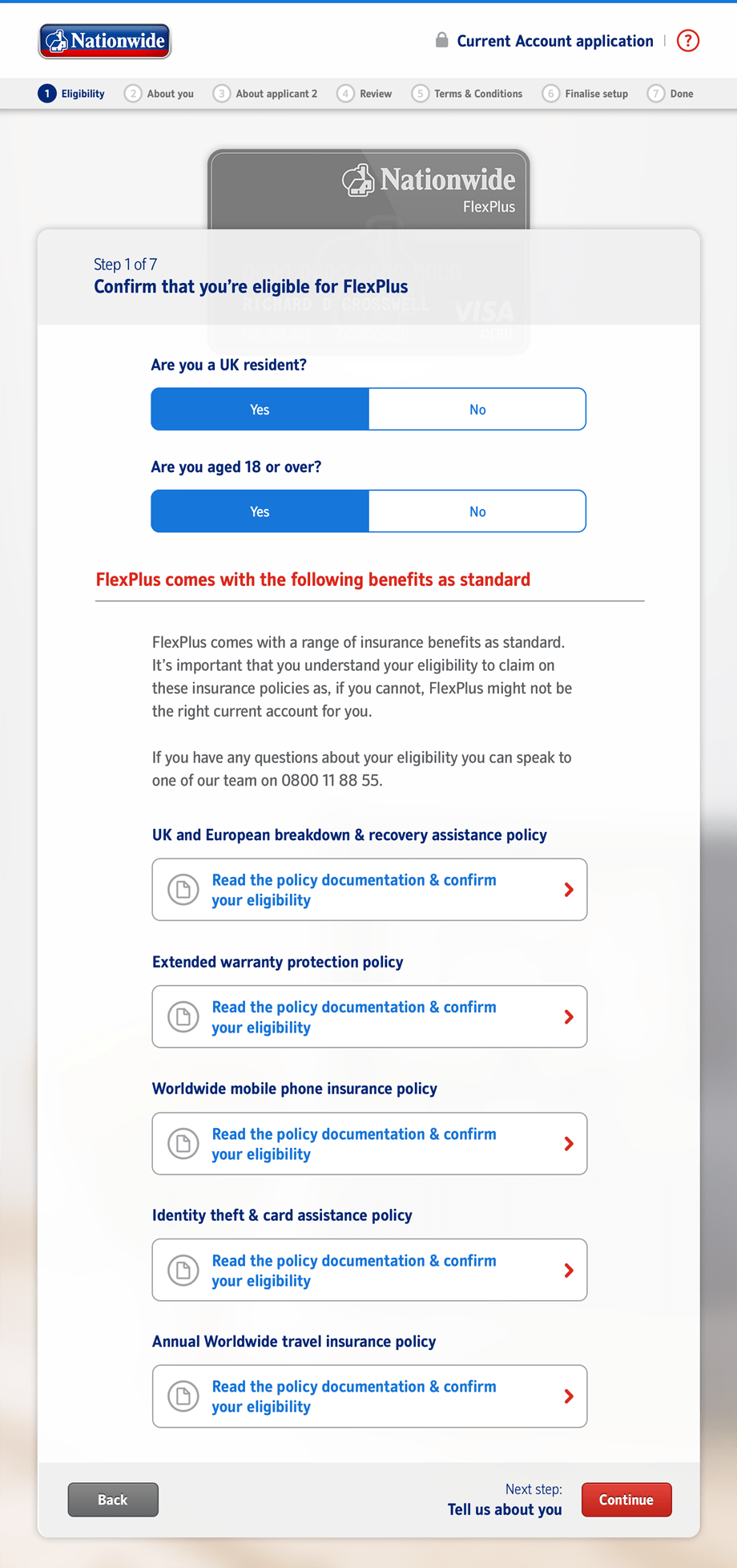
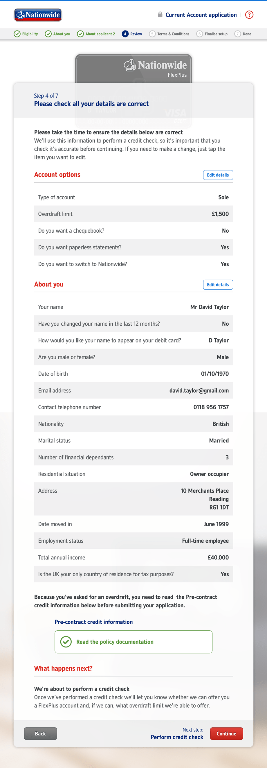
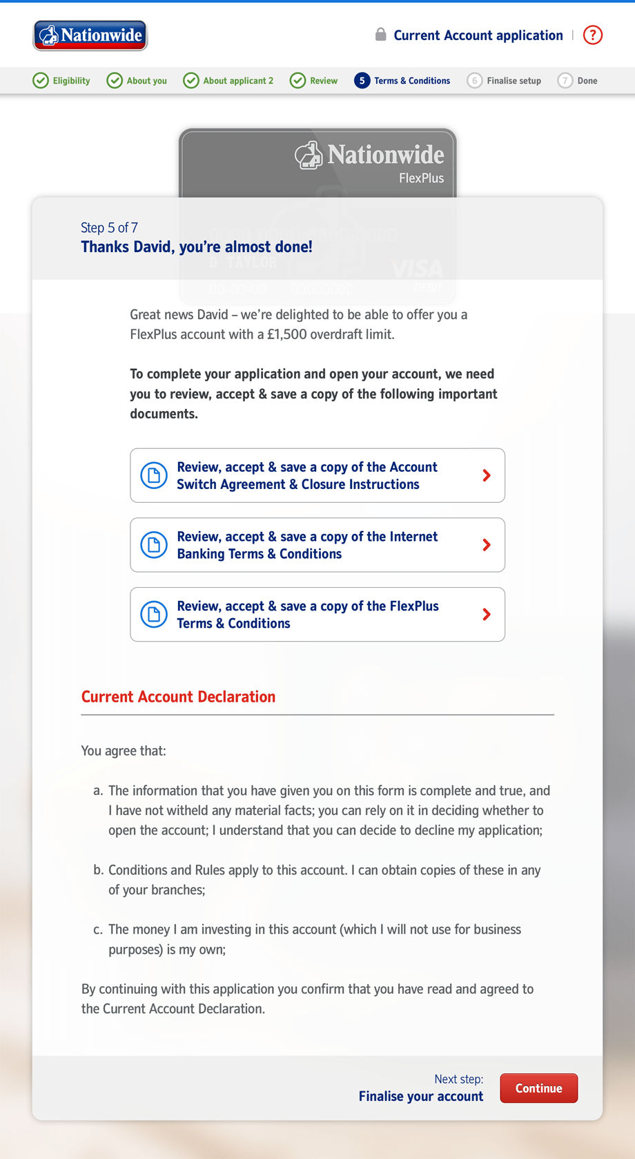
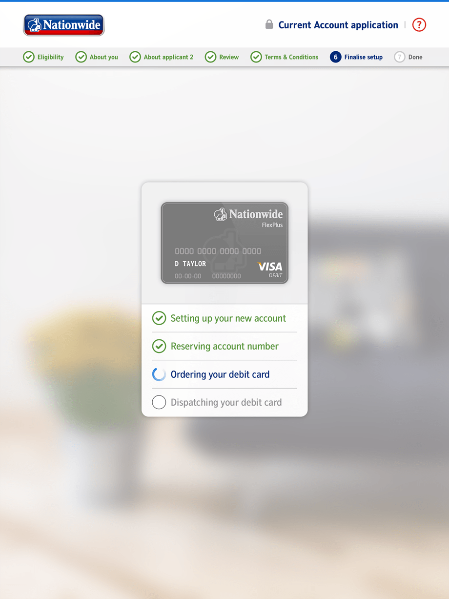
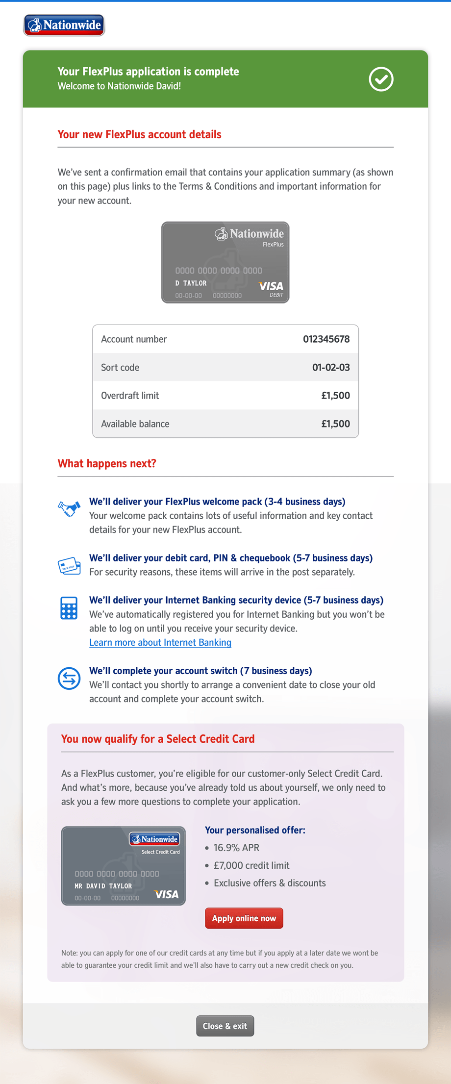
I created comprehensive documentation showing each step of the process, with all dependencies and logic. This helped overall development, compliance approval and socialisation of the new processes within the business.
