GE Capital Business Education Tool
Designs for an educational tool about ‘the middle market’, small–to–medium sized companies from across Europe who consistently outperformed the rest of their European peers.

Background
A Middle Market company is one that is too large to be a traditional SME, but not big enough to be truly considered “big business”. They generally comprise less than 2% of total companies but account for about 30% of economic activity.
In other words, they perform incredibly well when compared to their “big business” brethren.
GE Capital had a wealth of information on these companies, what drove their success and how they ran their businesses which was usually released as a series of PDF reports. Whilst these reports contained valuable data and insights, they lacked any kind of context, leaving it up to the reader to discern what this meant for their own business.
I worked with GE Capital to create an interactive tool based on all that insight that would bring more meaning to the data, allowing users to truly understand how Middle Market businesses were run and, by comparison, how their own business faired against them.
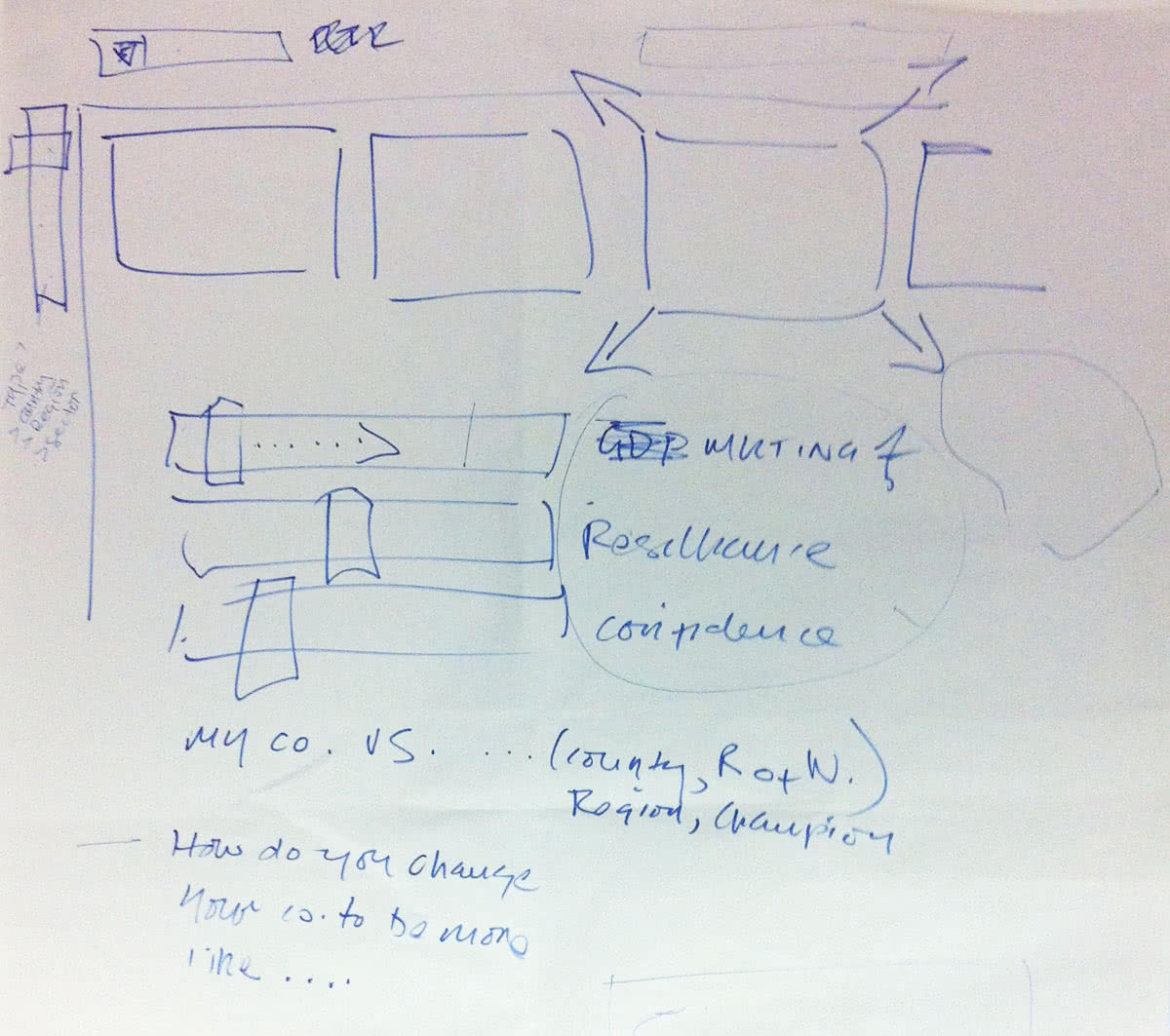
Above: The client’s initial sketch.
The idea
The brief was to create something “very interactive, with sliders, things growing and shrinking”. The client sketched their thinking out on a scrap of paper during our first meeting.
We delved into the report data, abstracting back to the set of questions originally asked to obtain the data. By allowing other companies to answer these questions, we could benchmark them against Middle Market companies thereby giving more context as to why they were so successful.
In addition to this, the tool would have to introduce the concept of a Middle Market company to an audience who may not have heard of them before.
Initial wireframes
I created a quick set of wireframes to start to draw out ideas — as with most projects, as soon as something visual is created the ideas and feedback start to flow. These wireframes allowed us to define the templates, inputs, content and hierarchy.
The tool would be structured into six sections:
- Global capabilities
- Formal processes
- Investment in growth
- Agility & adaptability
- Customer focus
- Focus on innovation
Within each section there would be up to six questions where a slider indicated the user response:
- Strongly disagree
- Disagree
- Neutral
- Agree
- Strongly agree
By going through each section and answering each question, we could provide an overall score for the user and compare that to the scores of the Middle Market.

Working with the GE brand
The next stage was to start on a higher fidelity set of designs. I knew a big part of this tool would be how it visualised the data and this, married to the gravity of working with the GE brand, meant I went through a lot of revisions, carefully working through my ideas, keeping what worked and discarding what didn’t.
I thoroughly enjoyed this phase of the project: the ideas flowed freely and the GE brand was a joy to work with.

Above: Design evolution of the summary screen showing different data visualisation options.

Above: Design evolution of the section detail screen showing different input methods.
Introducing the tool
The start screen explained the premise of the tool and asked the user for their business name and area of operation. We would then use this throughout the tool to personalise their results and compare them against the most suitable countries.

The dashboard
The overview screen was where all data was collated and displayed and was one of the hardest designs to get right. Dominated by the user’s overall score vs the Middle Market and a circular chart, scores and comparisons would be shown for each section allowing the user to get a complete picture of how their score built up.

Above: The empty dashboard. Users were prompted to start filling in sections to see their score build up on this page.

Above: The dashboard as seen when all sections are complete.
Building a score
Users would use the navigation on the left to move through the sections, answering questions to receive their score for both that section and for the tool as a whole. The user’s score was dynamically updated depending on how they answered to show how any particular answer affected the scoring. To bring even more context, we graded overall responses to make it easier to compare at a glance.

Above: The section template. Scores would dynamically adjust as the user amended their answers.
The final call-to-action
Once all sections were complete, users were prompted to get in touch with GE Capital to discuss their results and the Middle Market further. Although not viewed as an acquisition or lead generating tool, we did want to offer the ability to continue the conversation.

Above: When all sections are complete, the user is prompted to get in touch to learn more.

Above: Users get in touch via a simple webform.