MB Financial Rebrand Pitch
MB Financial are a Chicago-based bank offering a range of commercial and personal banking services. I created these designs as part of a digital rebranding strategy pitch.

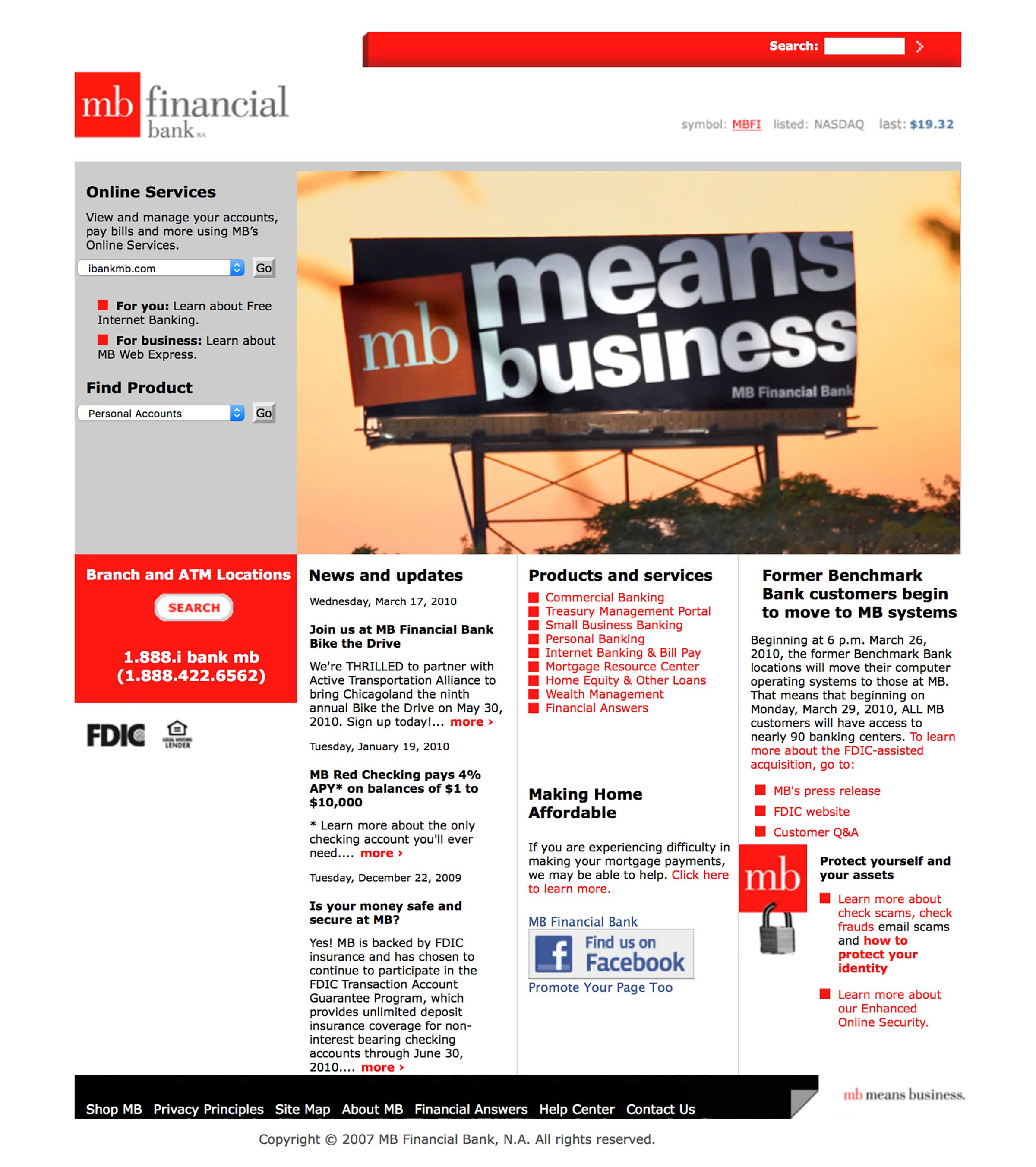
Above: MB Financial’s old website (circa 2010)
Background
The aim of these designs was to show how we might bring the MB Financial brand into the digital age. At the time, their homepage was a confusing array of links and densely packed content that didn’t reflect the brand well.
A flexible, modular homepage
I created a flexible homepage design that offered more effective product & marketing content and deep-links to various parts of the site.
I showed how the design could work harder to reflect the issues MB Financial cared about, using breast cancer awareness and the environment as examples. I wanted to demonstrate that the brand could talk confidently about non-financial matters whilst retaining authority.


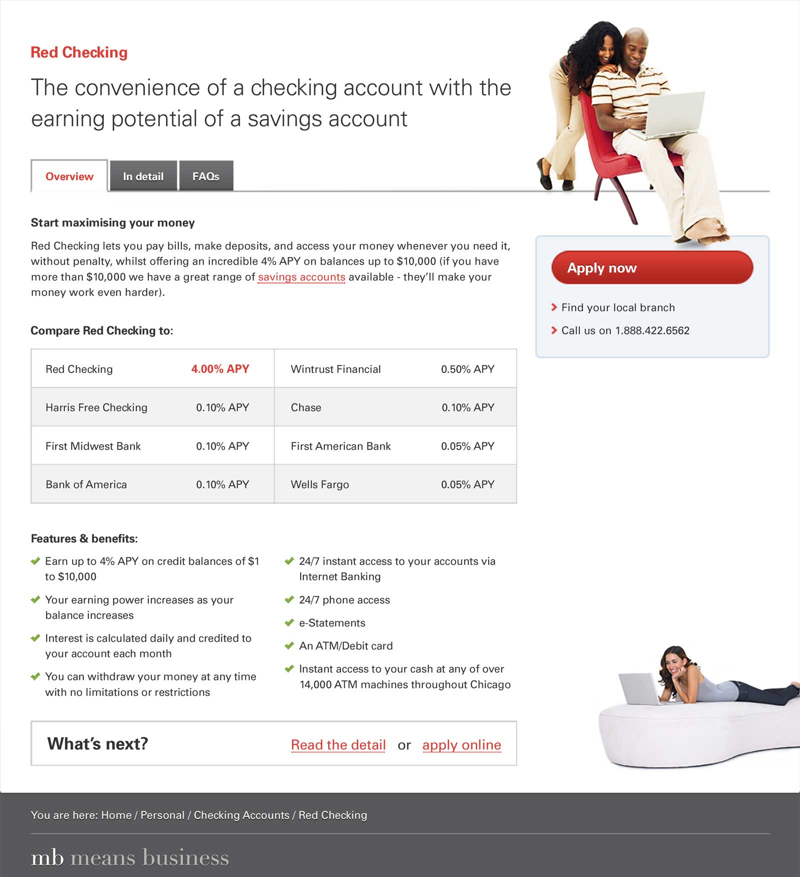
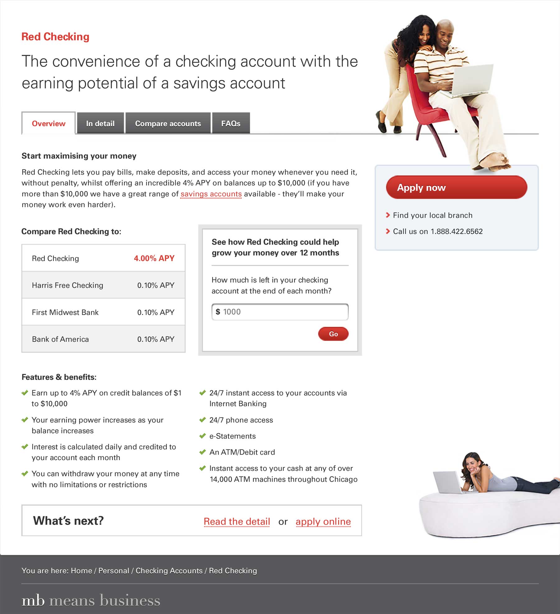
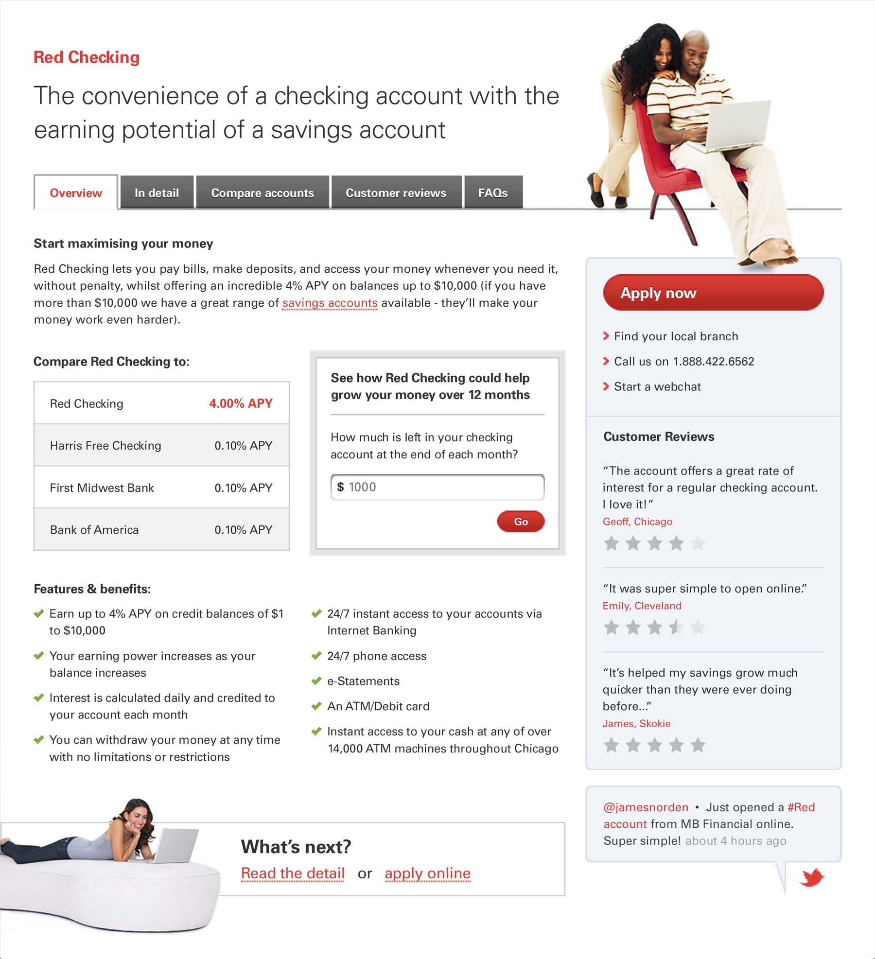
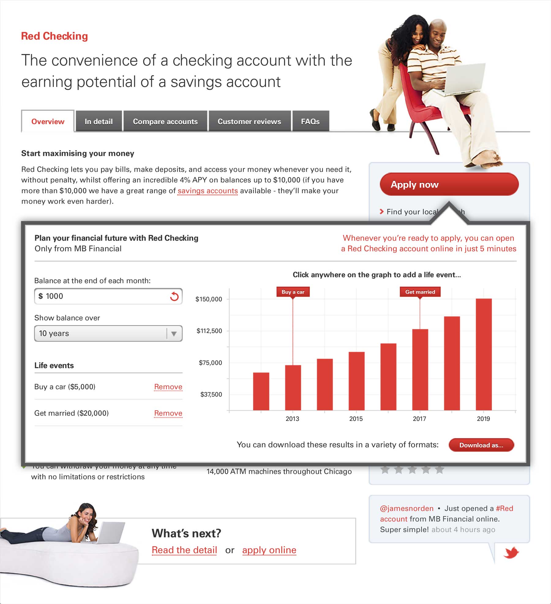
A product detail page designed to evolve
I used the product detail page to illustrate how MB Financial could deploy any new website design in stages. Product detail started small and simple, then grew over time to include more content types: comparisons, customer reviews, social integration and finally tools. Not only would this allow MB Financial to deploy any new site in a more agile manner, it showed how to use these content types to bring context and meaning to their products for users.