HSBC Group Corporate Website Redesign
A redesign of HSBC’s corporate website.

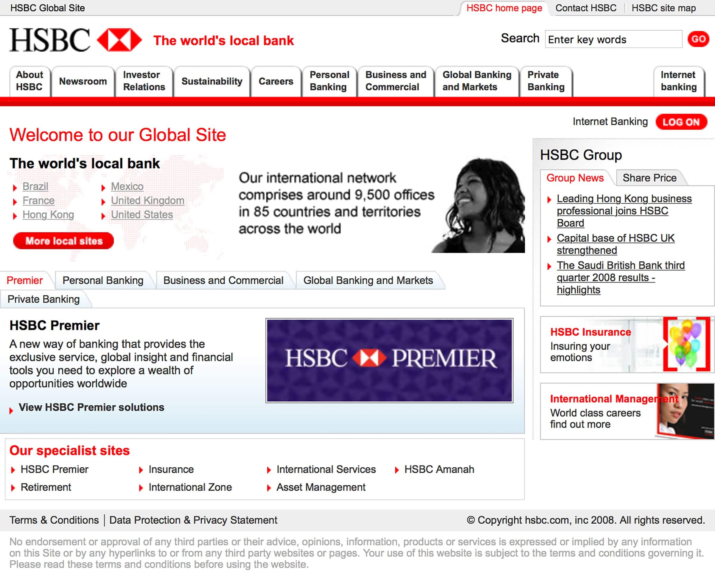
Above: HSBC Group’s old website (circa 2008)
Background
By 2008, HSBC’s corporate site (www.hsbc.com) was in need of a redesign. The layout was optimised for 800x600 and therefore it rendered poorly on modern screens. Additionally, the content was neither dynamic (based on where you were visiting from) nor easily updatable due to the rigid layout.
HSBC asked me to redesign the homepage to make it a more effective front door to their corporate website.
Defining the requirements
Analytics showed that more than 50% of visitors to the homepage subsequently left for an HSBC entity in another part of the world. This wasn’t surprising, given how much real-estate was given over to this feature — but it did suggest that people were using www.hsbc.com as a springboard to find HSBC in their own country.
As a corporate site, www.hsbc.com could not offer any banking products or services so the new design would need to make it clear that visitors to the site were on the corporate site, rather than a banking site — but it should also offer direct links to HSBC around the world to cater for users who wanted to do their banking, rather than read about the HSBC Group.
Lastly, a key success metric for any new design was flexibility of layout and content. The old design had just three customisable content slots (two of which were adverts) — HSBC wanted much more flexibility in terms of layout and content.

The old homepage (above) had a rigid structure with little capability for showing dynamic, contextual or relevant (timely, geographical etc.) content. By contrast, my revised structure (below) offered much greater flexibility in terms of content slots.

Designing a modular homepage
The new homepage design had a range of content slots that could be tailored by a range of metrics — geographical location, time of year, contextual or relevant content — alongside more traditional ‘rigid’ slots.
The new design was modular, allowing both content types and content layout to change and adapt depending on the messaging requirements.
A core part of the new homepage design was the geographical entity component. This detected where a user was visiting from (“Looking for HSBC in the UK?”) and suggested the most appropriate HSBC entity, alongside entity-specific links & content.


Flexible, scalable navigation
The masthead needed to support two levels of navigation as well as intra-site navigation and language selection. It had to be self-contained so it could appear over imagery, and it also had to work across multiple entities, propositions and languages.


Consistency across entities
To introduce an element of consistency between the corporate site and entity sites, I designed local versions of the masthead (Canadian and Chinese examples shown).


Consistency across sectors & products
I also created designs showing how the masthead could be rebranded at a sector/product level, retaining the familiar structure of the Group & entity mastheads.


Carrying the design through the rest of the site
Designs for all the top-level landing pages were created, alongside all necessary secondary and tertiary navigation.


