Leading the Creation of Cynergy Bank’s First Mobile Banking App
In 2023, I led the design of a brand new banking app for Cynergy Bank.
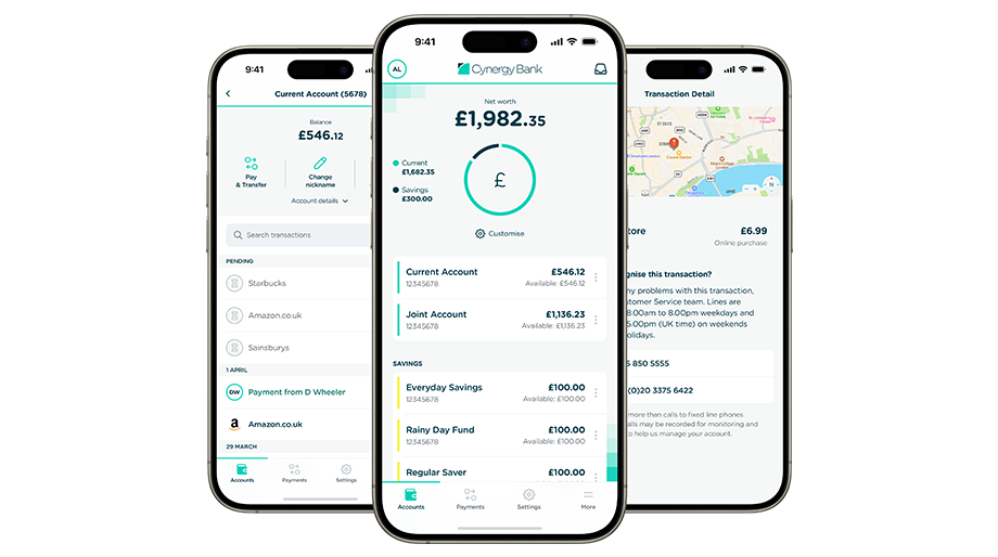
Background
Cynergy Bank are a relatively new bank in the UK: formed from the Bank of Cyprus’ UK operations in 2018, the brand is relatively unknown. In 2023, they had no mobile app and an old, clunky online banking system.
I was engaged to lead the design of a new mobile banking app, across mobile and tablet, that would inform the visual direction of the bank’s digital properties into the future.
Up and running, fast
A small, agile team within Cynergy wanted to design and ship the app, rather than farm it out to a large agency. To get buy-in from the business that we could actually do that, we ran a 6-week PoC sprint with the aim of proving to the business that a) we had the skills necessary to pull this off b) what a good app might look like.
I created some fast, initial sketches of key screens within the app, based on nothing more than a collective agreement on what we thought the app needed to do and presented these back to the team. This was a lovely way to work, free of many real-world constraints – those would come later!
As usually happens, seeing their ideas brought to life created a lot of excitement and we got the go-ahead to proceed with the design of the app proper.
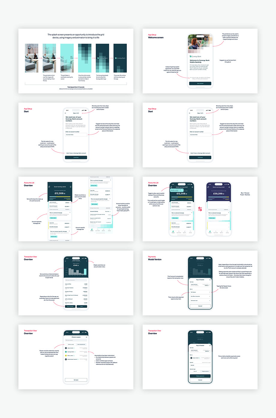
Maintaining the momentum
Once we had the go-ahead, we had to transition carefully from a PoC mindset to a ‘proper production’ one. This meant that we needed to unpick the designs created so far, write the user stories and acceptance criteria, cater for edge-cases and unhappy paths – essentially, transition into a series of processes that would actually let us launch the banking app.
Much of this happened in parallel, which fostered great communication amongst the team. Designs were rapidly reviewed, approved and built, whilst requirements were created.
To show the depth of thinking that went into this product, the sections below explain the core screens or journeys and the thinking that was applied.
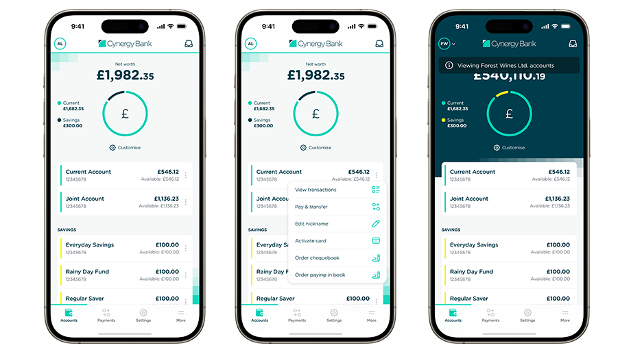
Accounts dashboard
The starting point for most journeys within the app.
- How many accounts should we cater for?
- What type of accounts will be supported?
- What information do we need to display for each account?
- Is there a character limit for the account name?
- How do we handle space issues where the name is too long to fit?
- What account servicing options are there for each account type?
- How will ‘net worth’ work?
- What does this screen look like for users with only one account?
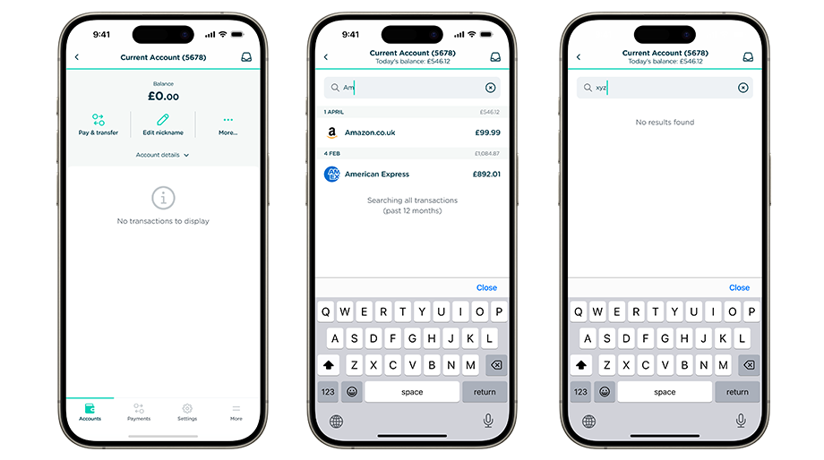
Transactions
A historical display of transactional activity on your accounts.
- How many transaction entries should we cater for?
- Are all transactions loaded in at once?
- What kinds of transactions will we be showing?
- What information do we need to display against each type?
- How should search work?
- Do we need any other filtering?
- What should this page look like for a brand new account?

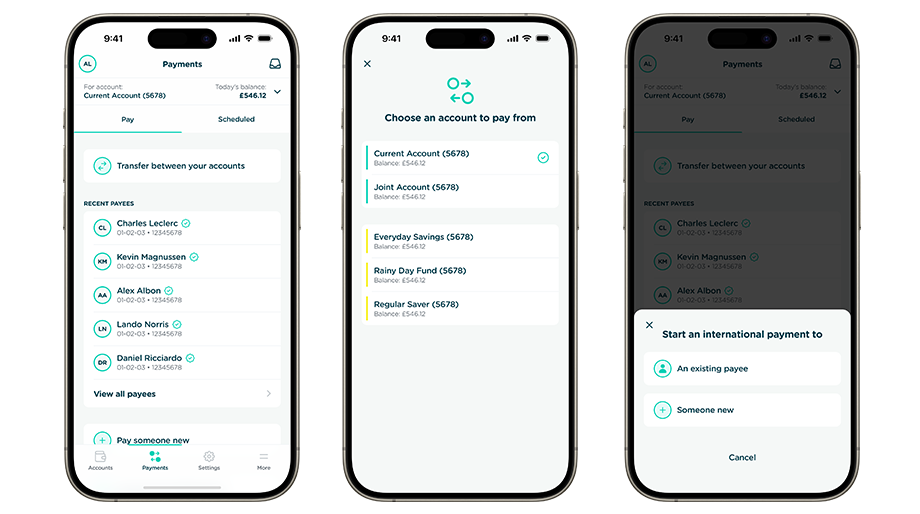
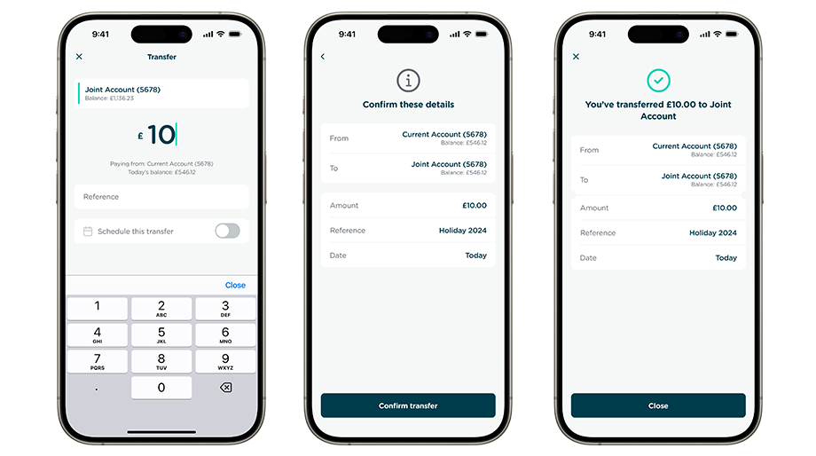
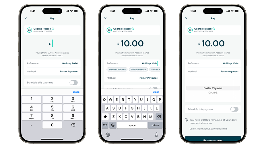
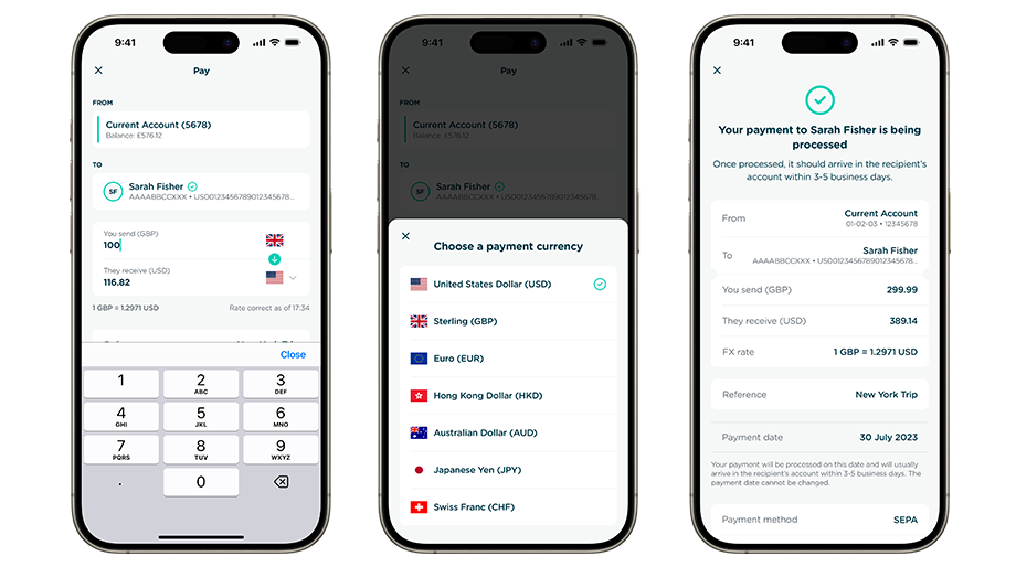
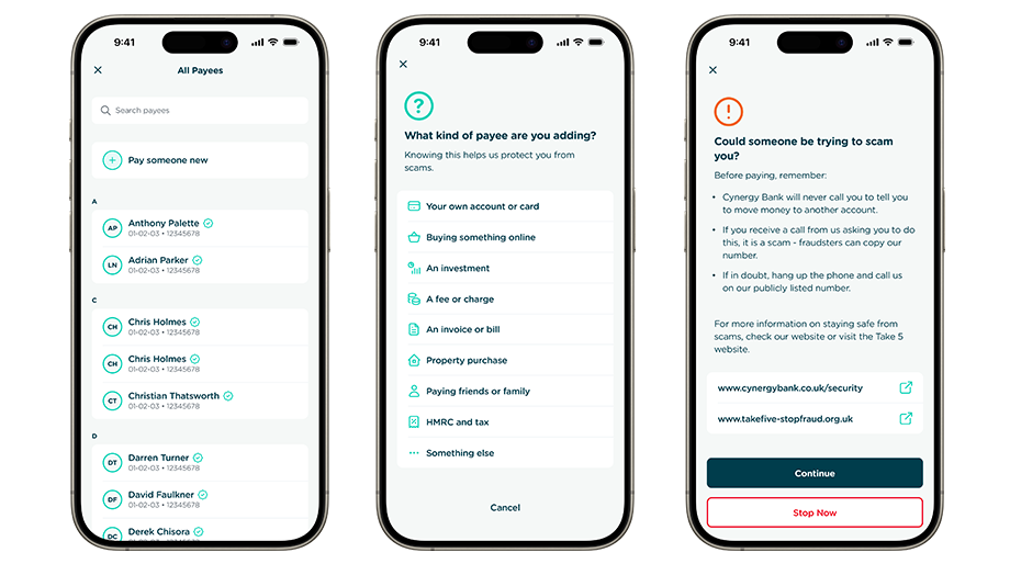
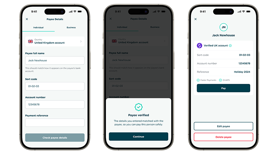
Payments
The most fundamental journey of any banking app. Important to get right!
- How should we think about payees vs payments?
- What payment processes will we support?
- How do payments differ between account types?
- How can we make payments as easy as possible?
- What security will we need when adding or paying new payees?
- What are the fraud risks?
- Do we understand all possible payment outcomes?
Settings
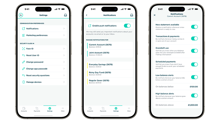
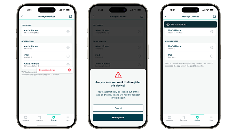
Where users can set their preferences and customise their experience.
- What notifications do we want to send to customers?
- What marketing preferences to we need to include?
- Do we allow users to change or reset their login details?
- How should a user manage the app on multiple devices?
Outcome
The designs were completed in late 2023 and the app is scheduled to go live before the end of the year. I’ll update this case study with the ratings for both app stores when the app is live.